My Online Retirement Calculator

Well, I’ve been retired for 3 months and looks like I’ve landed a contract starting next week.

I’ve been working on an online calculator and it’s now in a reasonable state. It’s lacking a lot of features that I would like, but I’ve run out of time for the moment. If you have a look, I think you’ll agree it has a lot more features than other available Australian online calculators already. Putting in this additional flexibility has been quite time consuming, and adding features has the potential to as well!

Rather than putting the whole project on ice, and waiting until it is perfect (i.e. never!), I’ve decided to put it out there. Some important caveats are that this calculator is really for people approaching retirement and wanting to find out when is the best time to retire. It’s also been developed under Google Chrome desktop, and this is the best means of running it (I don’t have the resources to do extensive testing!). The program is a BETA version and it’s also my first Javascript program!. If you spot any issues, please let me know!

I have found the existing calculators lacked precision, so have made this one more exact (e.g. it asks you the day you intend to retire, your birthday etc). Don’t be too put off with this, as you can change them later with sliders in the main page. You can also see how your assets change, and there is a numeric table which accompanies the graph. In addition, there is a “Mortality” graph which shows you the probability that you (and your partner if relevant) will be alive.

I’m not going to dwell on the calculator, other than to show, once again, how it relates to our situation!

Here is the graph showing expenditure by age. I assume we will live to 90, and we sell the investment property around September 2040. I’m already seeing a benefit here because previously my spreadsheets did not allow the sale of the investment property. Selling it makes sense as it can significantly increase the spend levels.

Note that when we sell the investment property, the funds go to cash. Later versions will allow this to go into another asset class. The same with if your super exceeds the 1.6M cap when you retire; excess will go into cash rather than, for example, remaining in the accumulation account or going into an ETF or similar.

And here is the graph showing the financial assets.

Here is the graph showing the mortality information.

Have a go and if you have any feedback, please let me know.

Risk and Return

In this post we look at the relationship between the riskiness of a portfolio and the corresponding expected spending patterns in  retirement. This will help with answering the question of what percentage of a portfolio should be in risky assets such as shares and what percentage should be in cash.

As usual I look at ourselves as a case study. In this post I look at one model of spending only. I assume we are a couple until 90, and then if we are still alive, we go onto the age pension only. At the end of each year, we work out the spending level for the next year by calculating the spending level for the remaining years that will make assets at 90 equal to zero, assuming the return on the portfolio for the remaining years is equal to the expected return, and spending is the same for each subsequent year (or in accordance with a specified spending pattern). This model has been discussed in previous posts.

If I have time, I will update the post to include mortality-based spending for the single person and the couple.

Portfolio Returns

For simplicity, in this post I assume that your portfolio is made up of shares and cash only. That is, there is no opportunity for further diversification into property etc.

In order to work out the returns and volatility of a portfolio with a certain percentage of shares and a certain percentage of cash, we need to know the returns and volatility for each of these asset classes.

For cash, I have assumed a real return of 0.5%, and a volatility of zero. That is, the bank will always give you 0.5% above inflation.

For shares, we need to look at historic returns. We did this back in the Retirement Calculations Post. Here is a graph that shows a 30 year moving average of real geometric returns (including dividends) for returns of the Australian Share market since 1953:

image1.gif

You can see that there is no overall trend for returns, and the average is around 8%.

And here is a similar graph showing a moving average for volatility:

image2.gif

You can see that volatility is increasing over time, and the average is around 17%.

If we have a mix of n% shares and m% cash, the return will be  0.08n + 0.005m, and the volatility will be n*.17.

Portfolios and Spending

We can now see what happens in our particular case if we invest  the proceeds of Super into various proportions of Shares and Cash.

Like the previous post, we use the staring position described in the Tweaks and Mathematical Diversions post, however now we use post-January 2017 age pension rates rather than pre-January 2017 age pension rates, and we will also use a more realistic spending drop of 1% per year from 65 through to 85.

The diagram below is an animation showing the spending patterns (note that in order to generate each individual graph, we only did 1000 runs, so it is not so smooth).

run-out-of-assets-at-90-gradual-decline

What is interesting here is that the average spend per year goes up quite a bit when we increase the proportion of shares, and there isn’t much downside. That is the likelihood of a low spend does not increase that much when we increase the proportion of shares.

The below graph should help with understanding this better. Note that the expected percentage of retirement below threshold statistic is a straight-forward average to 90 – that is it does not incorporate mortality data.

image3.gif

You can see in the graph that average spend increase quite a bit by increasing the percentage of shares (it nearly doubles if we increase the percentage of shares from 0% to 100%) and in most cases the expected proportion of retirement spent below various thresholds decreases when we increase the share ratio. An exception to this is the ASFA threshold, but there is only a minor increase.

The other interesting thing is that the expected percentage of retirement below the thresholds in the above diagram decreases sharply from a 0% to a  50% share percentage, and then drop off much more slowly.

Conclusions

In this post we have shown, under the assumption that share market returns for each year are normally distributed and independent, and follow historic averages, that it is sensible to have our Super assets invested in a portfolio with 100% shares. This portfolio mix provides the highest average spend, and offers very little downside over alternatives. This is a surprising result as most investment advisors advise reducing exposure to shares as you get older.

Downsizing

Many pending retirees are planning to downsize in retirement. Downsizing has the benefit of releasing funds from the sale of the family home. Other potential benefits including moving to a home which is easier to maintain and also moving to a location more suitable for retirement.

There can be disadvantages to downsizing however.  Downsizing often involves moving out of a familiar and desirable neighborhood and away from friends and relatives.

This post looks at financial strategies which can help retirees who would like to delay downsizing. Specifically we look at private and public sector Reverse Mortgages and also Home Reversion schemes.

As usual, we will use ourselves as case study.

Our Example

Let’s look at our case. In the 2016 in review post I updated a plan whereby we will sell the family home and move into another already owned property in a seaside town.

To recap:

  • I am married with no children, and am now 54. We are Australians but living overseas at the moment. We intend to come back to Australia at some stage (present date unknown!). The plan assumes we retire in early 2017, although this may change.
  • We own a house in a capital city which we intend to sell when I get to 64. Some of the house sale proceeds will go into superannuation at this time using the bring forwards rule, and remainder will go into cash.
  • We own an investment property.
  • We have Super and Cash assets.
  • Another property in a seaside town is a possible inheritance. This plan assumes that we move into this property when we sell our main residence, and it only becomes available to us at this time. However, if this does not eventuate, we will move into our investment property. This plan assumes the former, but the latter will have similar outcomes.
  • We intend to spend 10% less when we get to 70, and another 10% less when we get to 80. This reflects our likely spending requirements.

Here is the estimated spending pattern under this plan (with 2015 and 2016 shown as actuals):

image1

You can see the age pension becoming available at around 84. You can also see that our annual expenditure over the last 2 years has been very low (less than $40k!).

Here are the assets (in 2017 dollars), with actuals from 2014, 2015 and 2016:

image10.gif

You can see the house being sold at 64, and some of the assets going into Super and some going into Cash (now that the non-concessional limit has been reduced, as per the 2016 budget, not all of the funds can go into Super).

Now, let’s assume that we want to delay the sale of the house and the move to another location (aka Downsizing). In the absence of any additional strategy, this will involve a lower level of spending prior to selling the home, and a higher level afterwards. Here is an updated plan assuming we delay the move by 10 years and that we don’t leave until 74:

image3.gif

You can see that we are now eligible for the Age Pension at 67, ineligible again at 74, then eligible again at 84. Also, due to the limited amount of liquid assets prior to 74, our spending prior to 74 is lower than after 74. Ideally we would like to spend more in early retirement and less in later retirement in accordance with our chose spending pattern (10% less at 70, and another 10% less at 80) and we can no longer do this. Still, the spending levels are perfectly acceptable to me at least!

Here are the corresponding assets:

image11.gif

Note that I have assumed that the bring forward amount coming from the house sale can be invested in Super like assets. This should be a reasonable assumption given the SAPTO offset, but to understand the implications of this approach fully, a probabilistic approach would have to be used (refer here for an example).

Also, you can see the Super (and Cash) running out just prior to the house sale.

Here is a more extreme example whereby we plan to delay the move to 80:

image9.gif

You can see that expenditure prior to 80 is quite a bit lower than the spend in other plans.

Reverse Mortgages

One strategy to help delay the house sale while at the same time minimizing the impact on funds available for spending is based on the use of Reverse Mortgages. While Reverse Mortgages have received a lot of adverse publicity, regulations on these types of products have recently improved, and there are some real advantages. Firstly and most importantly you can access the equity in your home without having to sell it. Also, most reverse mortgage products allow you to access the equity in your home as an income stream or on an as-needs basis. That is, you don’t need to access the funds as a lump sum. This means that the income source from your home should not impact your Age pension, and also you only pay loan interest on the funds you have drawn. Finally most reverse mortgage products stipulate that there can be no claims on your other assets if you end up owing more on your reverse mortgage than your home is worth, and you cannot be forced to leave your home (this is known as the “no negative equity guarantee” or NNEG).

Disadvantages or include a high interest rate (which might be expected due to the longevity risk worn by the financial institution), the fact that you can only mortgage a percentage of your home (the percentage normally increases as you age) and the need for close management of the loan as the amount owing can increase quickly due to compounding (especially as the interest rate is variable and not fixed).

SEQUAL is an industry association that promotes home equity products and the maintenance and enforcement of strong consumer protection principles for the industry and it is generally recommended that you choose a product from a participating member.

So, lets take a look at how a reverse mortgage would work. I am using as an example the Commonwealth Bank product. At the time of writing, this product allows a reverse mortgage of between 20% (if aged between 65 and 70) and 40% (if over 85) of the value of the family home (this percentage is known as the Loan to Value Ratio or LVR), with overall maximum limits of between $275K and $425K. The annual interest rate charged is 6.37%. As the level of detail in the CBA pdf is not that great, I have made certain assumptions about the product. Refer here for these.

Here is the diagram showing the spending patterns if we sell the family home at 74, and take out a reverse mortgage that commences at a time that results in our spending patterns being leveled out. I have assumed an interest rate of 6.37% throughout the mortgage.

image5

You can see that there is no increase in spending after selling the house and we maintain the 10% reduction at 70 and 80. Under the plan, the reverse mortgage value gets to about 19% of the house value. The total real (2017 dollars) of the amount borrowed is $257K. If we borrow more than this then spending prior to selling the house is too high, and if we borrow less, then it is too low.

Here is the diagram showing the assets (real values):

image6

I have again assumed for the purpose of this post that I can contribute the bring forward amount of house sale proceeds to Super-like investments.

Note that the light Blue House Value is the value nett of the outstanding reverse mortgage amount. You can see the value declining near the time it is sold.

You can also see that during the period between taking out the reverse mortgage and selling the house there are no super or cash assets.

What about if we wanted to stay until 80?

Well, this is more complicated because the optimal solution involves borrowing more than the upper limits imposed by the CBA product. Here is the optimal solution, assuming there are no limits on how much we can borrow against the mortgage:

image8

In this solution, the Reverse Mortgage gets to about 53.5% of the house value, and the real amount borrowed is approx $602K.

And here is the solution within the CBA limits:

image12

Here the real value borrowed is approximately $272K. Note that this is  less than the $325K available if we started the loan at 74 because of the interest charged and also the discounting of the value of the loan by inflation.

What about another Reverse Mortgage!

It is possible to reverse mortgage our downsized second home in order to release another income stream. This would elevate spending again. If we are over 85, we could release 40% of the house value and this could feed into higher spending prior to 85.

Would we want to do this, if so when, and what are the disadvantages?

Here is the diagram for the second reverse mortgage, assuming we take it out so that drawdown funds are available up until 90, and assuming that we sell the house at 74:

image14.gif

You can see that the funds released in the second reverse mortgage mean that the first reverse mortgage cannot bring forward enough funds to maintain our spending pattern. i.e. after the house sale our spending will now increase rather than remain flat.

Also, at 90, we are living on the Age Pension. As described in the mortality post,  at the age of 87 it is more realistic to assume that we will live past 90, so a lower spend should be planned for. It is possible to combine this post with the mortality post to work out when it is best to take out a reverse mortgage assuming a plan based on expected longevity. I might do this later!

There is one significant advantage and one significant disadvantage to a second reverse mortgage.

The significant advantage is that the reverse mortgage never needs to be paid back because we will not be moving to another home.

The significant disadvantage is that there is potentially a small (or no) residual to be paid to any  beneficiaries on death, and also, in the event that one of us needs to go into Aged Care, the lack of a property may impact on the quality of the Aged Care service. I’ll do a post on Aged Care soon in order that we can understand this better.

Using the Reverse Mortgage as described above, here is reverse mortgage value as a percentage of the house value.

image15.gif

So, for example, if we were go into Aged care at 94, approximately 50% of the house value would be available to fund Aged Care.

The Pension Loans Scheme

There is an alternative to the private sector reverse mortgages. The Pensions Loans Scheme is a scheme administered by the Federal Government and has the following characteristics:

In order to be eligible:

  • You (or your partner) must be over Age Pension age.
  • You must have equity in Australian Real-estate.
  • You must not be drawing the full age pension.
  • Your ineligibility for the full age pension must not be due to both the assets test and the the incomes test.

And:

  • The most you can receive is the difference between the Age Pension and your present part Age Pension (which may be zero). The amount is paid fortnightly (i.e. it cannot be taken as a lump sum) and is not taxable. So, for example, if you are not eligible for the Age Pension at all, you could receive up to the Age Pension.
  • The fortnightly interest rate is 5.25% (effectively 5.4% annual rate). According to this article, the rate is fixed.
  • You can continue to borrow while the value of the loan is less than Age Component Amount * (Value of Realestate Assets – Guaranteed Amount)/$10,000. The Guaranteed Amount is the amount  that you wish to retain on death. If you have more than one property, you can choose which to use in the assessment for a loan.
  • You can find the Age Component amount here (buried in the act documents!). Effectively you can borrow from 17% (at 55) to 67% (at 90).
  • You must pay back the loan when you die or when you sell the home.
  • I couldn’t find anything on the no negative equity guarantee (i.e. there can be no claims on assets outside the collateral in the event that the loan exceeds the value of the collateral). However, I believe that this would apply.

Could we use this type of loan and if not, for whom would it be attractive? Under this loan, the most income per year you can receive is the Age Pension. This assumes that you are not eligible for the any Age Pension e.g. you have at least $823K in assessable assets. Or if your assets are lower,  you could receive a lower amount. The problem is, if you have these assets, you are unlikely to want to take out a loan and pay the loan interest rate! i.e. it would be more sensible to use your assets for living expenses rather than taking out a loan, but if you do this, you eventually become ineligible to take out the loan!

Seems to me that there aren’t many circumstances where this loan would be attractive. Maybe it has been deliberately made so in order not to compete with private sector products. Some people have recommended that the Age Pension eligibility criterion be removed for this product.

Home Reversion Schemes

Home Reversion Schemes are another type of scheme which permits pensioners to access equity in their homes. The idea behind this type of scheme is that you can sell a proportion of your home for a lump sum. When you sell your home, go into aged care, or die, the vendor of the product receives the agreed percentage of proceeds.  The lump sum you receive is a proportion of the percentage value of the home, with the proportion getting larger the older you are.

There is only one vendor of Home Reversion Schemes in Australia, Homesafe. The characteristics of their scheme are:

  • The scheme is only available to home owners in some postcodes of Sydney  and Melbourne.
  • You must be over 60.
  • The land value of the property must be at least 60% of the value of the property, as assessed by an independent valuer.
  • The maximum percentage of the home that can be sold is 65%.
  • Normally the lump sum is between 35% and 65% of the percentage of the value of the home at the time the contract is signed. This will normally vary according a number of parameters, one of the most important being age.
  • You retain title in the home.
  • Because you receive a lump sum, this may impact on your pension.

The percentage of the house value that you receive is not published, so it is difficult to assess what kind of deal you are getting. Assuming that you don’t leave the family home, then this is equivalent to receiving a lump sum injection while sacrificing a percentage of the home for use in Aged Care or to leave to beneficiaries. Further modelling for our own situation would be dependent on availability of percentage discounts assigned to the house percentage.

Vendor Risks

It is interesting to look at the vendor risks for these types of products.

For the Reverse Mortgage product, the main risk is that the value of the outstanding loan becomes higher than the value of the property. This is more likely to occur where the property value declines or does not increase as fast as expected, the owner remains in the property for a longer time than planned, or interest rates increase to a higher level than planned. These are mitigated to some extent via the aged-dependent Loan to Value Ratio, a higher than normal interest rate, and also, where the loan is taken progressively, including the interest in the amount that can be loaned.

For the Home Reversion product, the main risk is that the value of the lump sum is not recovered (with interest) when the home is sold. This is more likely to occur in the same set of circumstances, i.e. the . property value declines or does not increase as fast as expected, the owner remains in the property for an especially long time, or interest rates increase to a higher level than planned. These risks can be mitigated by ensuring the percentage of the home given as a lump sum is appropriately discounted.

Conclusions

If you are planning on downsizing to help finance your retirement, the use of private sector Reverse mortgages can help with extending your stay in the family residence. We have shown that in our case, under certain assumptions by using Reverse  Mortgages we can delay the move from our family home by about 10 years with only minimal impact on spending patterns.

The Federal Government also offers a type of Reverse Mortgage service, however there are very few instances where this services is likely to be useful.

Home Reversion Schemes may also be of help to the retiree, especially when you want to quarantine a proportion of your home for beneficiaries or help with Aged Care.  It has not been possible to model how we could use a Home Reversion product because not all details are available/published.

Would I use one or more reverse mortgages?

Comparing my original spending plan with the plan using two reverse mortgages, the spending levels are roughly the same, except that in the latter, I can maintain spending levels and leave my home in 20 years rather than 10. Still, I would prefer not to manage a reverse mortgage if I didn’t have to, and having a sightly lower level of spending may be an acceptable trade-off (so the plan to leave at 74 without a reverse mortgage, which only involves a $10K reduction in spend prior to the house sale may be perfectly acceptable). The risk of interest rates going higher, and the capital in the home disappearing quickly is a real one, and something I would prefer not to deal with.

I think I will see how are our actual spending levels pan out in the first years of our retirement and if there is a real need for additional funds to see if a reverse mortgage is likely to make sense.

(*) The information on the CBA website is a bit light on details. I placed a few calls to CBA, but call center staff were not that knowledgeable either and suggested an appointment at a branch!

I have made some assumptions to help with the analysis. The general principles in this blog should remain valid, but if some of the assumptions prove incorrect, there may be need to be some minor adjustments.

I assumed:

  • The Bank will continue to loan you money while the outstanding value of the loan is less than the maximum limit. If you take the loan as a lump sum, then this means you can borrow the full amount of the maximum limit. However, if you take the loan progressively,  then you can only continue to draw down funds while the outstanding value of the loan is less than the maximum. As the outstanding value will increase due to interest and fees, and the real maximum value declines over time, this effectively means the real value that you can borrow will be less than the nominal maximum amount. I have based this assumption on the somewhat cryptic comment in the CBA product pdf: “Should the borrower/s choose to draw down the facility on a periodic basis, the full amount of the facility limit may not be available due to the capitalised effect of interest and fees.”
  • The loan limit applicable is the limit at the time you took out the loan. That is, if for example, you have an outstanding reverse mortgage loan and you turn 85, you don’t get access to more funds reflective of the increased maximum loan at this age.
  • I didn’t factor in any fees other that Interest. That is, I didn’t factor in setup fees, withdrawal fees (if any) etc. These should only have a minor impact on the overall result and introduce unwanted complications.
  • I assumed maximum loan limits increase with inflation, although once the loan is taken out the limit is fixed.

Note that:

  • I have worked out the amount owing on the loan based on similar techniques described in the “Mathematical Diversions” post.
  • The total amount owing on the loan can be a lot more than the loan limit because there is no fixed date for paying it back. This is why the bank limits the amount you can borrow and this varies by age!

Analysis of the ALP Super Plan

In this post I take a look at the Super plan that the ALP has proposed to be implemented should they be elected into government. This analysis is especially timely as the 2016 Australian Federal election is approximately one month away, and significant changes to the Super system were recently announced by the LNP government as part of the 2016 Federal Budget. These LNP changes are unlikely to be become law if the ALP wins the Federal election.

What is the ALP Super Plan?

Information on the ALP Super plan may be found here.

The first section of this site describes a policy that taxes Superannuation returns in Pension mode in excess of $75,000 at 15%. The information on the ALP site is actually quite confusing (perhaps deliberately so) because it first states:

The proposed measure would reduce the tax-free concession available to people with annual superannuation incomes from earnings of more than $75,000. From 1 July 2017, future earnings on assets supporting income streams will be tax‑free up to $75,000 a year for each individual. Earnings above the $75,000 threshold will attract the same concessional rate of 15 per cent that applies to earnings in the accumulation phase.”

and then states:

This measure will affect approximately 60,000 superannuation account holders with superannuation balances in excess of $1.5 million”

These statements are inconsistent because you may very well have significantly less than $1.5M in superannuation assets but still have more than $75,000 in superannuation income for a particular year. In fact this is quite likely because the average Super fund typically returns in excess of the 5% assumed by the ALP (e.g. the Australian Super balanced fund has averaged 8.69% per year since 2004, and this includes the GFC).

The $75,000 threshold appears not to be indexed to inflation. Most commentators (e.g. here, here and here) have concluded that the $75,000 is not proposed to be indexed, although some have speculated otherwise (e.g. here). To quote from the second commentary:

LABOR’S proposed superannuation tax on wealthy retirees could eventually hit more older Australians because it will not be automatically indexed to inflation.

Opposition treasury spokesman Chris Bowen yesterday said a future Labor Government would consider lifting the $75,000 threshold when necessary but dismissed automatic indexation.

“I would expect any government of the day would monitor the thresholds to ensure that the original policy intent was being met and would respond accordingly,’’ Mr Bowen told the National Press Club.

For the purposes of this post, I have assumed it is not indexed. Should authoritative information become available which contradicts this assumption, I will update the post.

The second part of the site describes a plan to reduce the Higher Income Superannuation Charge (HISC) threshold from $300,000 to $250,000. I won’t look into this second part as it will not impact many Australians (and a similar policy is already part of the LNP Plan).

Who will be impacted by the ALP Plan?

The ALP plan looks fairly benign (after all, not many people have over $1.5M in super), but we will investigate to see if this is actually the case. The policy can and will impact many people with considerably lower balances than $1.5M because:

  • Super returns are, on average, higher than 5%.
  • Super returns are not the same every year, but actually have a fairly high variation. During the years that Super returns are high, the government of the day will collect a high tax from Super members, while when the returns are negative, the retiree will suffer the losses with no compensation. An example I provided earlier may be found here.
  • The $75,000 limit is not indexed. So, the $1.5M limit (which will actually be smaller in any case if the average return is used) will diminish overtime. The process will be accelerated when we move away from the present historically very low inflation rates.

How to mitigate against the effects of the policy

The obvious mitigation to this policy for a couple is to split Super between individuals. That way each individual essentially receives half of the returns, and there will be less likelihood of being subject to the tax. This kind of splitting is likely to be less easy under the new LNP rules regarding non-concessional limits (should they become law).

Another mitigation is to move some of your funds outside the Super system. In 2016, income below $18,200 per year is tax free. Furthermore if you are above retirement age, SAPTO allows, in 2016, a tax rebate of up to $57,948 for a couple. If you have funds in the super system and believe that you may be subject to the tax, then you could place some of your funds in, for example, a combination of cash and index trackers such as this one.

As an example, say you are below retirement age but over 60, have $2M in super, the Super rate of return for the year under analysis is 10%, and the Index funds/Cash combination you invest in also returns at this rate:

Tax without Super Splitting, No index fund: $18,750

Tax with Super splitting, No index fund: $7,500

Tax with Super Splitting, $500,000 in Index fund: $2,584

Tax with Super Splitting, $364,000 in Index fund: $2,040

Note that the latter is the optimal (retrospective) solution for a 10% return. By making assumptions about the distributions of returns from Super and the Index fund, it would be possible to provide a recommended optimal mix between the Super fund and the Index fund. If the ALP form a government in 2016, I may do this in a later post.

Further mitigation strategies would include postponing selling your (tax exempt) PPOR until existing Super assets are reduced.

See here for more information on mitigation.

An Analysis of our Situation

As usual, I will look at how this policy will impact on us.

I will look at the impact of the tax through three models, increasing in order of sophistication and realism, and also compute power!

Model 1 – Assumes a constant Super return each year with no variation, and a constant spend. This is the model used by the ALP when determining the impact of the tax.

Model 2 – Assumes a constant spend and variable Super return.

Model 3 – Assumes a variable Super return and a spend that is calculated at the end of each year that would result in Super being zero at 90 under the assumption of standard inflation and Super returns for remaining years.

Model 1 – Constant Super Return with no variation

In this section I will assume a constant Super return of 5.5% in the accumulation phase and 6% in the pension phase, as per the analysis described in the Tweaks and Mathematical Diversions post. At 6%, we would need more than $1.25M in the Super pension phase account to be subject to the tax.

Here is the spending plan prior to the tax, this time showing, for the purposes of comparison, the tax in accumulation mode.

image10.gif

Super Returns are always the same, no Super splitting

If I  deduct 15% of any earnings above $75,000, as per the ALP Super tax without Super splitting, it appears that the policy is fairly benign. Here is the spending plan with the ALP tax policy in operation:

image11.gif

As you can see, there is not really too much difference (about $700 per year).  Total ALP Super tax is approx $25.6K in 2015 dollars and to get back to our original spend, we would need an additional approx $30.5K.

Super Returns are always the same, Super splitting

OK, what if we split Super between accounts? Well, in this case there is no impact because Super is always below $2.5M, the amount that would be required to cause tax to be levied, assuming a 6% return.

Super Returns are always the same, Effect of Inflation

Unlike most other policies, the ALP Super Plan is impacted by higher inflation, so let’s see what happens when the rate of inflation increases.  We can expect a higher tax as the $75K is not indexed. In addition, Super returns will be higher, so we can expect higher taxes.

Here is the diagram with no Super splitting, and assuming an additional 3% inflation becomes the norm, for a total of inflation rate of 5.73%. Total ALP Super tax is now $145K in 2015 dollars. As you can see, this is quite significant when compared to the accumulation tax.

image12.gif

And here is the same diagram, but now assuming we split Super. Total ALP Super tax is now approx $77K in 2015 dollars.

image13.gif

The diagram below shows the effects of various inflation rates. For reference, and as a sanity check, the spend with zero tax is also shown. As expected, spend does not change much with increasing inflation without the tax.

image21.gif

And here is information on the historic inflation rates in Australia (from the ABS site). You can see that inflation has been pretty stable since about 2001.

image15.gif

Note the region between the two horizontal bars is the RBA target range for inflation.

Model 2 – Constant Spend and Variable Super Return

Now lets take a look to see what happens when we have variable returns. We can expect higher tax and lower spend when we take into account variable returns, because the Super member will get hit for higher taxes in the good years, and will not be compensated in the bad years.

Luckily an analysis of the impact on retirement of variable returns has already been completed in the More on Risk post. In this post we looked at, amongst others, the impact of variable super returns on the length of time that Super would last assuming a constant spend.

Here is the graph showing the distribution of ages at which funds run out, assuming there is no tax as described in More on Risk. I have used, for the moment, the Age pension rules prior to the 2015 budget changes as described in this post. Note that the spend levels here are the spend levels which cause Super at 90 to be zero assuming no Super return variation (which is an average spend level of $90,463, as described here):

image3.png

Note that the average age is 90.36. I have colour coded showing the 60% of results that are less than 20% percentile and higher than the 80% percentile as green , and the 80% of results which are less than the 10% percentile and higher than the 90% percentile as green and blue.

The diagram below provides summary data for a number of scenarios using the colour coding above:

image5

And here is similar information for the amount of tax:

image6

Constant Spend, Super Returns are variable, Sensitivity to Volatility

As Super returns become more volatile, we can expect the average age funds will last to be reduced. This is indeed the case.

Here is how the Age at which funds run out varies as we increase volatility, assuming this time we split super, and spend at the rate where we solve for super being zero prior to the 2015 budget changes and any taxes:

image8.gif

You can see that the average age to which funds last declines as volatility increases, but not significantly so.

And here is the average total ALP Super tax (in 2015 dollars) by volatility:

image9

Note that the volatility of the Australian Super Balanced fund returns over the last 17 years is about 7.5%, and the volatility of the Vanguard ASX Index fund over the last 10 years is about 21%.

Finally, here is the Age funds last until by Volatility without the Tax:

image10

You can see that the average does not vary much, but total variation increases quite a bit.

Constant Spend, Super Returns are variable, Tax by Age

The diagram below provides details of the average ALP Super tax by Age when assuming variable returns, and also assuming we do not split Super. The spend levels are those which make Super at 90 equal to zero for the standard fixed returns of 6.0% and the ALP Super tax without splitting. For comparison, I have included the taxes for the fixed returns. Total ALP Super tax for variable returns is about $75.5K, while total tax for fixed returns is about $25.6K. I have assumed post 2015 Budget pension rates.

image18.gif

Here is the distribution of the amount of tax by age. Note that I have not included the zero tax possibility in the diagram as this would tower over the other probabilities (in most years zero tax is paid after 64):

image20.gif

Model 3 – Variable Super return and a spend that is calculated at the end of each year to make Super zero at 90.

OK, before we start modelling the ALP Super Tax increases with model 3, let’s look at the results of this model with the updated pension rates (the More on Risk post had the old pension rates). I will also present the results of this model in some different ways:

Here is the spend per year for this model using the new pension rates:

image22.gif

Here is a graph showing the spend in more detail, this time including the full distribution for each year:

image26.gif

The result is not so smooth as only 4000 runs were done.

OK, let’s take a look at the results for the ALP Super tax. The graph below shows the average spend for the spend prior to the 2015 pension changes, after the changes, the ALP super tax with splitting, without splitting, and without splitting and 5% inflation:

image23.gif

And there are the taxes for the last three policies:

image24.gif


Why I dislike the ALP Super Tax!

The ALP has given two reasons to support the introduction of their Super Tax:

  1. The majority of the Super Tax concessions go to the top income earners, and these concessions are unlikely to reduce future Age Pension expenditure significantly.
  2. The cost to the Tax payer for the Super Tax concessions in the form of forgone revenue is large and growing and is not sustainable.

The ALP Super Tax will indeed have the effect of reducing Super tax income concessions in Pension mode to top income earners, and this is a good thing. However, it will not impact the Super accounts of these same people when in accumulation phase (unlike the LNP policy, which restricts the amount that can be contributed).

The Tax will also have the effect of gradually affecting more and more people as the $75K limit is eroded by inflation, eventually affecting everyone. In addition, significant chunks of people’s life savings will be eroded in the event of high inflation or high market volatility, both of which are outside the control of the retiree. The government will gather more tax, and more people will be find themselves on the Age Pension sooner. The tax is a disincentive to getting ahead, not only for high income earners, but also for average person.

Conclusion

When I started this post, I suspected that the ALP super plan would have a significant impact on people like me, mainly because of the high taxes in high return years. I gave an example to show how this would work. In order to better understand the impact of the tax on us, I have used three models:

  • In the first model, I assumed that Super returns are always the same, and solved for Super being zero at 90. I looked at splitting and not splitting super funds between individuals in a couple, and also looked at the impact of an increase in inflation.
  • In the second model, I assumed that Super returns are normally distributed and the spend per year (adjusted for inflation) is static. I worked out how the age at which Super funds run out is impacted, and how much additional tax is due. I looked at splitting and not splitting super funds between individuals in a couple, and also looked at the impact of the Super return volatility.
  • In the third model, I assumed that Super returns are normally distributed and the spend to be used for each year is worked out in advance as the value that makes Super at 90 zero, assuming a constant spend and standard rates for Super and inflation for remaining years. I looked at splitting and not splitting super funds between individuals in a couple, and also looked at the impact of 5.7% inflation.

These models showed that in our situation:

  • If we do not split Super between accounts, the ALP super plan will result in an additional tax of $25.6K (model 1), $66K (model 2) or $68K (model 3).
  • Super splitting can significantly reduce tax ($25.6K to zero in model 1, $66K to $27.8K in model 2 and $68K to $25K in model 3).
  • Tax to be paid and average spend is very sensitive to increases in inflation. The higher the inflation, the more real tax to be paid and the less to spend. Tax goes up quickly with inflation increases.
  • Tax to be paid is also sensitive to Super return volatility, although quite a bit less sensitivity than to inflation. The more volatility, the higher tax to be paid.

Given the sensitivity to inflation, and the inability of the retiree to influence it, it would make sense to index the $75K threshold to inflation.


The Telstra Super Calculator

I came across the Telstra Super Calculator recently and it is quite good. It is now officially my favourite calculator! It can be found here.

If you haven’t used this yet, it is highly recommended as it has a number of features which can help early retirees, and also has a number of unique features.

It has the following features:

  • It allows you to Retire at any age (many calculators enforce a minimum limit)
  • It allows you to contribute money to Super  (as a non-concessional contribution). Unfortunately it does not allow you to contribute more than $180,000 (i.e. no accommodation for the “Bring Forward” rule), and also only allows you to contribute prior to retirement.
  • It allows you to see how your plans would fare in various typical Super performance scenarios.
  • It includes information on how likely you are to outlive your super.

Unfortunately it doesn’t support many of the features required to properly model early retirement:

  • It doesn’t allow you to survive on cash prior to accessing Super. It forces you to start spending your Super at 60 if you are retired earlier that 60.
  • It doesn’t allow you to contribute to Super after your are retired.
  • It doesn’t support the “Bring Forward” rule when making contributions prior to retirement.
  • It doesn’t support different levels of spending as you age.
  • It doesn’t support logical mortality-based decisions on reduced spending as you age.

Still, it is a nice calculator. It’s not actually in the interests of these Super companies to support modelling early retirement as they would like to encourage you to work as long as possible (so that you can lodge nice large balances  with them!).

I would like to compare this calculator to all the other calculators I have looked at, but unfortunately legislation has changed since then, so it is no longer possible.

I will show here how it can be used in my situation as of beginning of 2016.

Using the Calculator

For my situation, I will once again have to model using starting at 64, because the calculator does not support the Bring Forwards rule and living on cash prior to retirement.

Given the assets at the beginning of 2016 (Cash $708K, Super $615K), the amount of Super I will have at 64 is now calculated to be $1,598,695 in 2016 dollars. Note I have removed the reduction in spending at 70 and 80. If I now use the calculator and set:

  • My retirement age to be 64 and my spouse to 62.
  • An investment income of $5,136
  • An investment asset of $260K
  • Use the Balanced return of 7.2%, adjusted by -1.2% (for a return of 6%)
  • Percentage fees to 0%
  • Insurance premiums to $0
  • Inflation to 1.7% (1.7% because the Telstra calculator uses a wage inflation discount of 1%, and I do not use this)

image4

Then the Telstra calculator produces this:

image1

image2

image3

My calculator comes up with $98,500, so this is pretty close. Note that the Pension doesn’t cut-in until 84. This is because of this assumption relating to the calculator:

” In the projection, the Age Pension is indexed with wage inflation, while the asset and income test thresholds are indexed in line with price inflation.”

Because I am effectively discounting the Age pension by the inflation rate rather than wage inflation, this means the Age pension is indexed to inflation and the asset and income test thresholds are discounted by inflation less 1% (Hence the later Pension age, and also the slightly lower overall spend). Or in other words, I can’t exactly map my model to the Telstra assumptions.

There are ten investment performance scenarios that can be tested. Here are the results, showing the age at which funds run out:

image5

The average is 90.4, and standard deviation 4.75. This can be compared with my More on Risk post, which does something similar (except 64,000 scenarios are tested!).

Conclusions

The Telstra calculator is a nice calculator and has some features which can help the early retiree. If you are nearing retirement, I recommend you give it a go.


Age Pension Indexation

One deeply unpopular measure in the 2014 Federal budget was the removal of the existing indexation system used for the Aged Pension. This measure was never passed by the Senate and so never became law. In the 2015 Federal budget the original indexation system has been officially reinstated.

The Age Pension indexation system involves increasing the pension twice a year by the maximum of the increases in the CPI and a special pensioner living cost index (the PBLCI). It is also “bench-marked” to male total average weekly earnings (MTAWE). For a home owning couple the benchmark rate is 41.76% of MTAWE. If the increase in the pension resulting from the maximum of the CPI and the PBLCI is less than the benchmark rate, which has been occurring in the majority of cases to date, then the benchmark rate applies, as described here.  If the benchmark rate is less than the increase due to the CPI/PBLCI increases, then the CPI/PBLCI rate applies.

This article argues that this system is unfair, over-compensates pensioners and suggests that CPI indexation is more appropriate. I half agree with this article, however CPI indexation is not the answer as this tends to under-compensate. The reason is that if the pension is indexed to CPI it is likely that the amount of funds received from the pension will not allow pensioners’ lifestyle to keep pace with improvements in the way the rest of Australians live. To give an example published elsewhere,

For example, if the latest model washing machine has increased in price, it is compared to the model it has replaced to see if it has any improvements compared to the previous model.  If it has any improvements, the price increase reflected in the CPI is adjusted downwards by the estimated value of the improvement(s).  So, if for example the current model has increased in price by 4% and it is ascertained that the improvements account for half of the 4% total price increase, the CPI will only reflect a 2% price increase.  The trouble is, if you can’t buy the superseded model, then your pension hasn’t been adequately increased to meet the new price!

If you accept that pensions should be indexed to community standards, then indexing to CPI is not appropriate. However neither is indexing to MTAWE because:

  • The community is made up of males and females. The pension should be bench-marked to TAWE rather than MTAWE.
  • The median income more accurately reflects community standards than the average, so benchmarking to the median is more appropriate.

This article provides more information about the effects of making these types of changes (along with  lot of other pensioner-unfriendly changes!).

2015 Federal Budget News Flash

In this post I have a quick look at the Federal 2015 Budget. I am writing this on the Friday prior to the budget, but it seems some of the budget details are available now:

http://www.abc.net.au/news/2015-05-07/budget-government-to-outline-changes-to-age-pension/6450946

How do the changes to the budget affect self funded retirees?

The major changes that have been introduced are changes to the Full Age Pension and Part Pension asset thresholds. After the changes the maximum amount of assets that you can own while still being eligible for the Part pension will be reduced (from $1.15M to $823K for a home-owning couple), and the maximum amount of assets you can own prior to losing the full pension will be increased (from $286.5K to $375K for the same couple). This changes will come into effect during Jan 2017.

Essentially if you are presently on the Part Age Pension and do not have many assets, you will either experience no change or will be better off, while if you are asset rich, you will be worse off (in some cases significantly so).

As usual, I look at how this will effect our circumstances::

  • Previously it was estimated we would be eligible for the part pension at 74, but now the estimate is that we will have to wait until we are 80 to be eligible.
  • If we spend the same amount that we were planning prior to the changes, we will run out of money just after 88 rather than my 90th birthday. That is, we have lost two years of funding.
  • If we adjust our spending so that we run out of funding at 90, then our average spend goes down by about $2000 per year, and
  • We can match my pre-budget level of spending if we save an additional $69,500. That is essentially we are about $69K worse off!

The good news is that the full Pension indexing to AWE, which was slated for removal in the 2014 budget, will be retained and the amount of assets you are allowed prior to losing the full pension has been increased. It seems that the 2014 Budget eligibility changes to the Commonwealth Seniors Health Card (and the Seniors Supplement changes?) may be shelved (although this needs confirmation).

The reasoning behind the changes is that the Age Pension is really meant as a safety net rather than as a supplement to savings.

Before 2015 Budget

image1.gif

After 2015 Budget:

image2

Conclusions

  • One of the important aspects of planning for your retirement is financial planning. It’s important to most people to understand how much they need to save in order that they have a good chance of attaining a certain level of income.
  • While a certain amount of savings may help to obtain a desired income level, there are many risks that may result in a lower income than expected. Significant risk categories include Market Risk, Longevity Risk, and Legislative Risk. For each type of risk, there may be a mitigation strategy which can help to reduce either or both of the probability of the risk occurring and the overall impact of the risk.
  • The 2015 Budget change is an example of a legislative risk being realized. If you have recently retired, have a reasonable amount of assets, and don’t have much prospect of returning to work, you are now likely to have less income than planned.
  • Of course, legislative risk doesn’t go away after the 2015 budget. There are many other legislative risks. Taxing superannuation returns is just one example, and is proposed by the Australian Labour Party, http://www.alp.org.au/fairer_super_plan. Taxing pension returns is already in place in the UK, and thresholds are quite low. We could see the labour party introduce their proposed policy here, with thresholds creeping down as successive governments seek new sources of  revenue.
  • How to mitigate against legislative risk? Well, one possibility is to  to try to reduce your investments in asset classes that the government is likely to further regulate, for example superannuation. Another is to save more than is recommended fully realizing that governments are likely to change the rules during your retirement or while you are saving for your retirement. That is, you could form a buffer against future government intrusions into your savings. Unfortunately this is likely to make you an even bigger target for confiscatory governments. Alternately, rather than working those extra years and then being constantly disappointed as governments take chunks out of your wealth, it might be best to realize that income is a means to an end, that is enjoyment of life. Australia provides a good safety net for pensioners in the Age pension, and this is likely to continue. It might make sense to spend up in your early retirement while you are healthy and active, get the enjoyment from your savings, and then live modestly when you hit old age. It is possible to model this kind of approach and this may be the subject of a subsequent post.

Mortality

In this post I will use morality statistics to help with planning for retirement. Integrating mortality statistics into retirement planning is complex, but also rewarding. As such, this post is a bit longer than usual and may take a bit more effort to understand. The post is divided into two main sections:

  • The first section considers how mortality statistics can help with retirement planning for single people, i.e. not part of a couple. I have chosen to discuss this first as some of the results and reasoning in this section are used for the second section.
  • The second section considers how mortality statistics can help with retirement planning for couples

Mortality statistics can, and will, be used to:

  • Create graphs illustrating longevity information.  These graphs can be used to give you an idea of how long you are going to live and provide other useful information.
  • Create spending plans that take into account how long you are likely to live.  To date, we have used an arbitrarily chosen age of 90 as the date we require funds to last. We can create more sensible plans now that we have mortality information.
  • Provide information on the funds you can expect to leave to beneficiaries on death. Now that we have mortality information, we can work out the expected value and distribution of funds left on death.

This post should help with the Aged Care post which I will develop soon. I am interested to find out how Aged Care impacts on the expected value of assets which we can leave to beneficiaries.

Mortality Statistics

Australian Life tables can be accessed here:

http://www.abs.gov.au/ausstats/abs@.nsf/mf/3302.0.55.001

These tables provide, amongst others, the statistic qx – “the proportion of persons dying between exact age x and exact age x+1. It is the mortality rate, from which other functions of the life table are derived;”

This statistic is available for Males and Females (and also each state of Australia) and is the only stat I have used in this post.

Mortality and the Single Person

Before we start, let’s look at the information that can be provided by mortality statistics to help with planning retirement for the single person.

Single Person Mortality Statistics

We can work out the following:

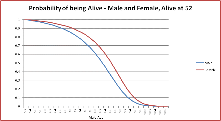
  1. The probability of being alive at a particular age, given we are alive at another age. The diagram below shows this information for an Australian male who is alive at 52.

image1

This graph can be generated by observing that the probability of being alive at n, given that the person is alive at 52 is simply:

{\displaystyle \prod_{i=52}^{n-1}(1-q_{i})}

  1. The probability of death between n and n+1, given that you are an Australian male and alive at a given age. The diagram below shows this for age 52.

image2

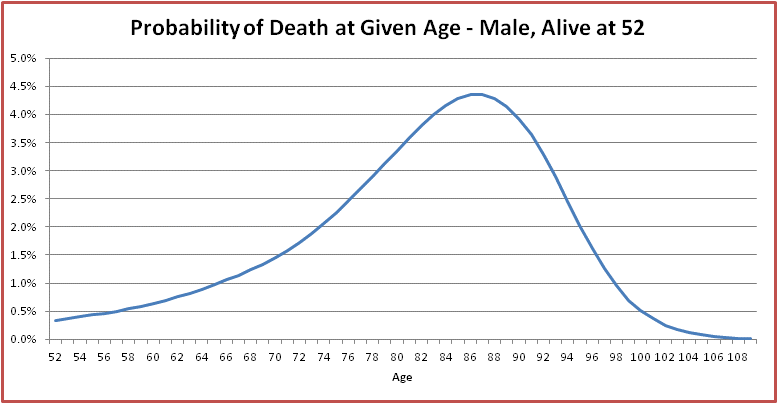
This graph can be generated by the following formula for the probability of dying between n and n+1, given the person is alive at 52:

{\displaystyle q_{n}\prod_{i=52}^{n-1}(1-q_{i})}

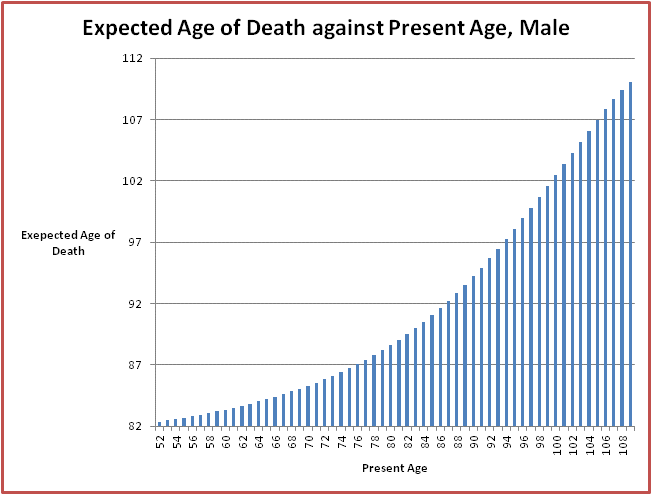
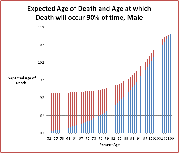
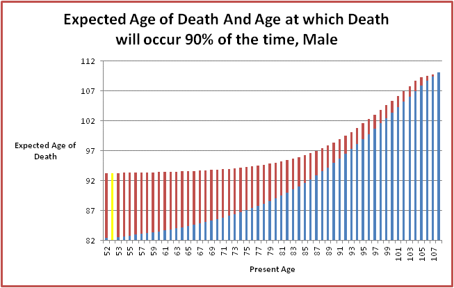
  1. The expected age of death for an Australian male, given that you are alive at a certain age. For a 52 year old male, this is approx 82.4. The formula used to determine the expected age of death give you are alive at n is:

{\displaystyle n+\sum_{j=n}^{106} (j+0.5)q_{j}\prod_{i=n}^{j-1}(1-q_{i})}

Below is the graph showing the expected age of death for an Australian male for each age from 52 onwards:

image3

  1.  The age at which an Australian male will be dead p% of the time, given that they are alive at age n. This is similar to the expected age of death. To work out this age, we need to look at the graph in point 1 above. Say for example, I am an Australian Male alive at 52, and I want to know the age at which 90% of the time I will be dead. To find this figure, we look at this graph:

image5

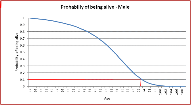
You can see from the above graph that at age 52, 90% of the time the Australian male will be dead by the age of approximately 93.

Mathematically, we choose the age n that satisfies the below:

{\displaystyle\min_{n} (\prod_{i=52}^{n}(1-q_{i})<0.1)}

The graph below provides this information for an Australian Male starting from the age of 52. The information is superimposed on the average age of death for reference:

image4.gif

OK, now have done some preliminaries, we can progress to working out spending patterns and remaining assets for the single person.

Single Person Spending Patterns and Remaining Assets

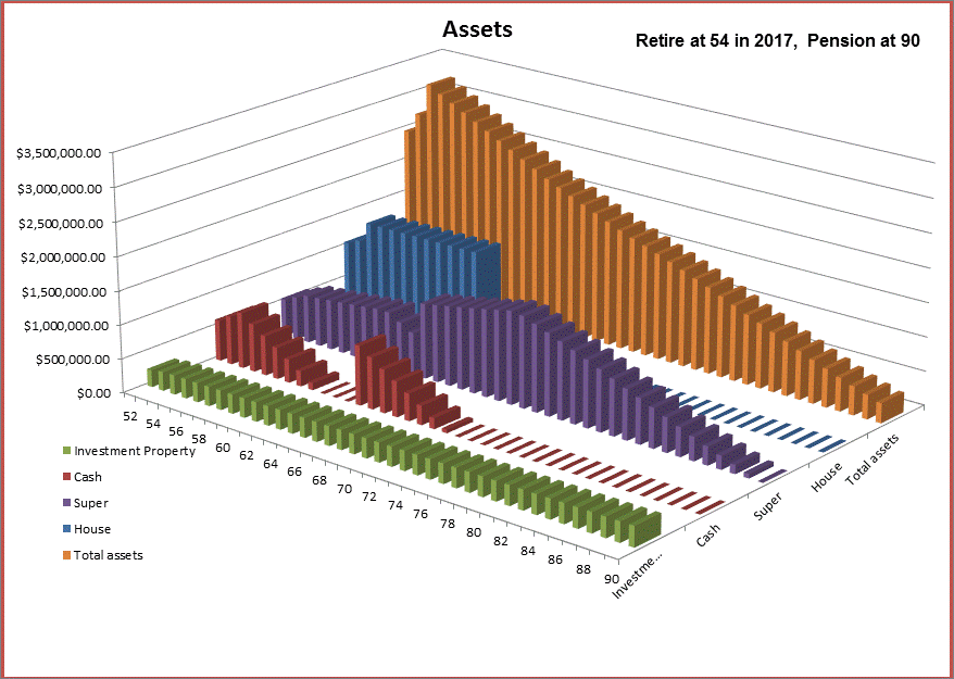
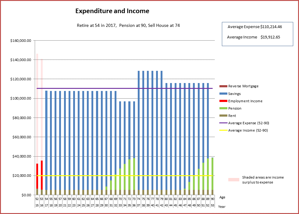
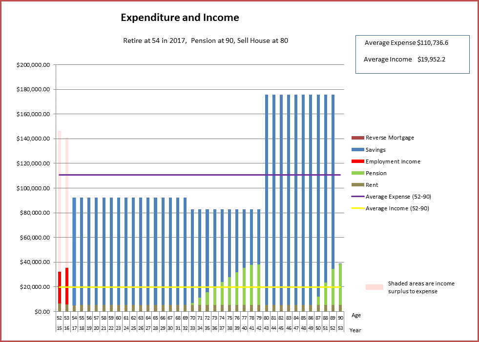
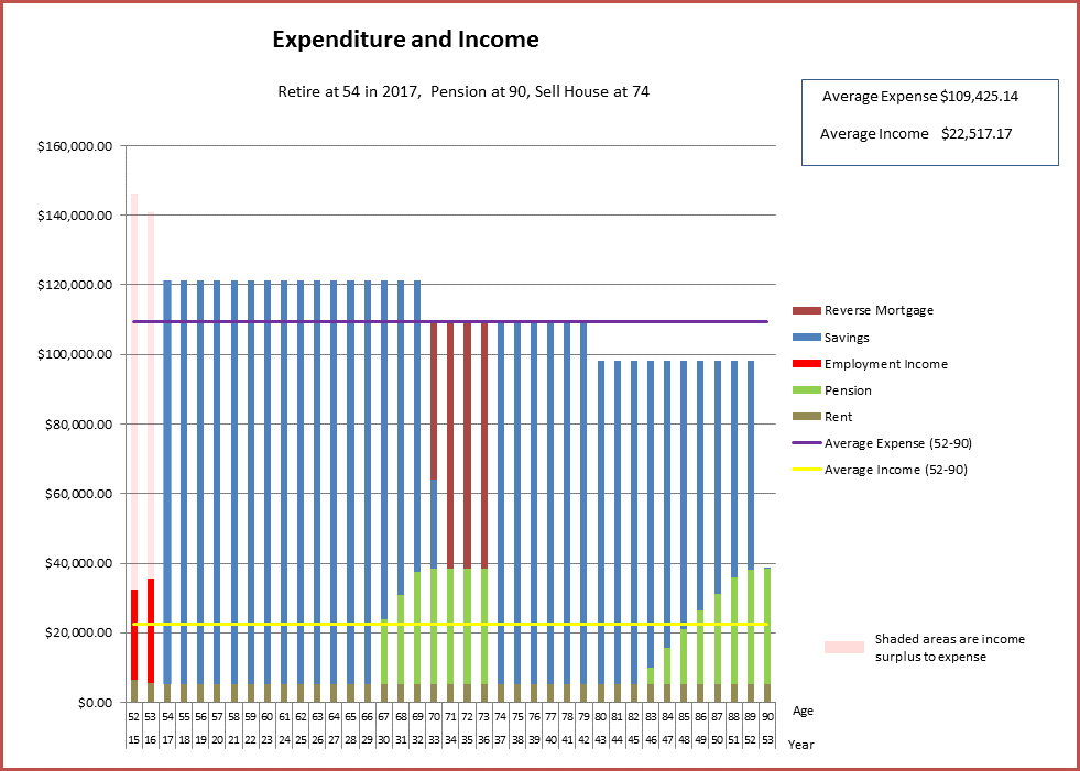
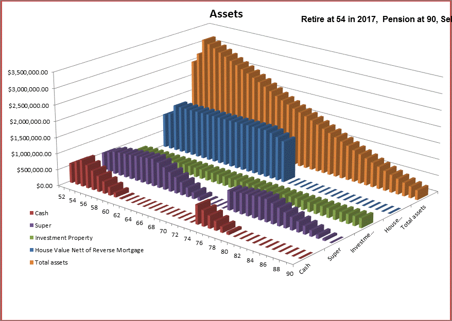
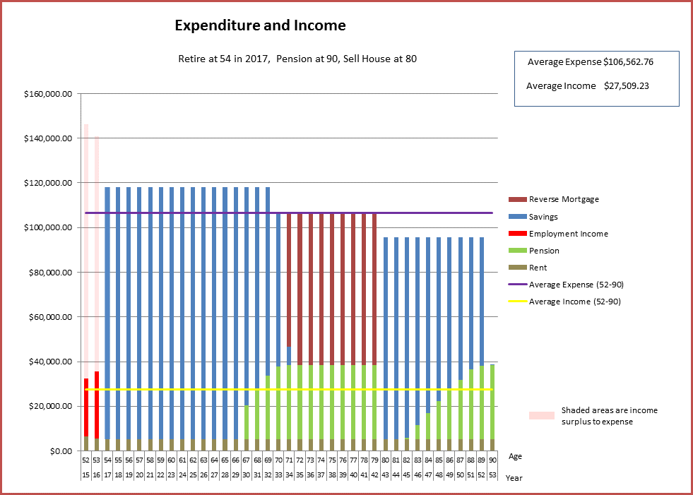
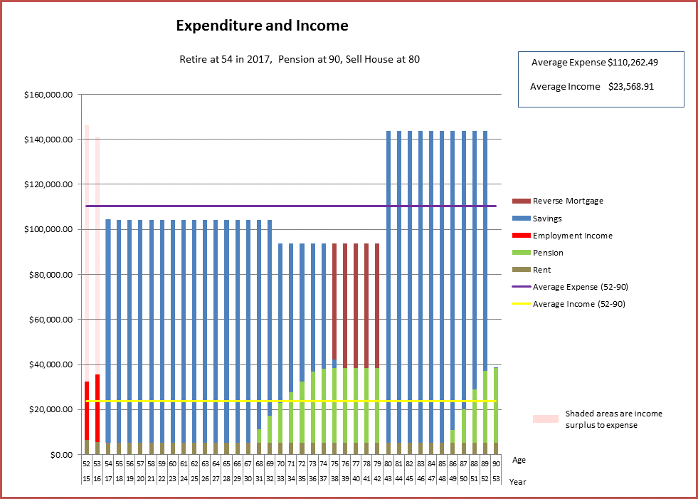
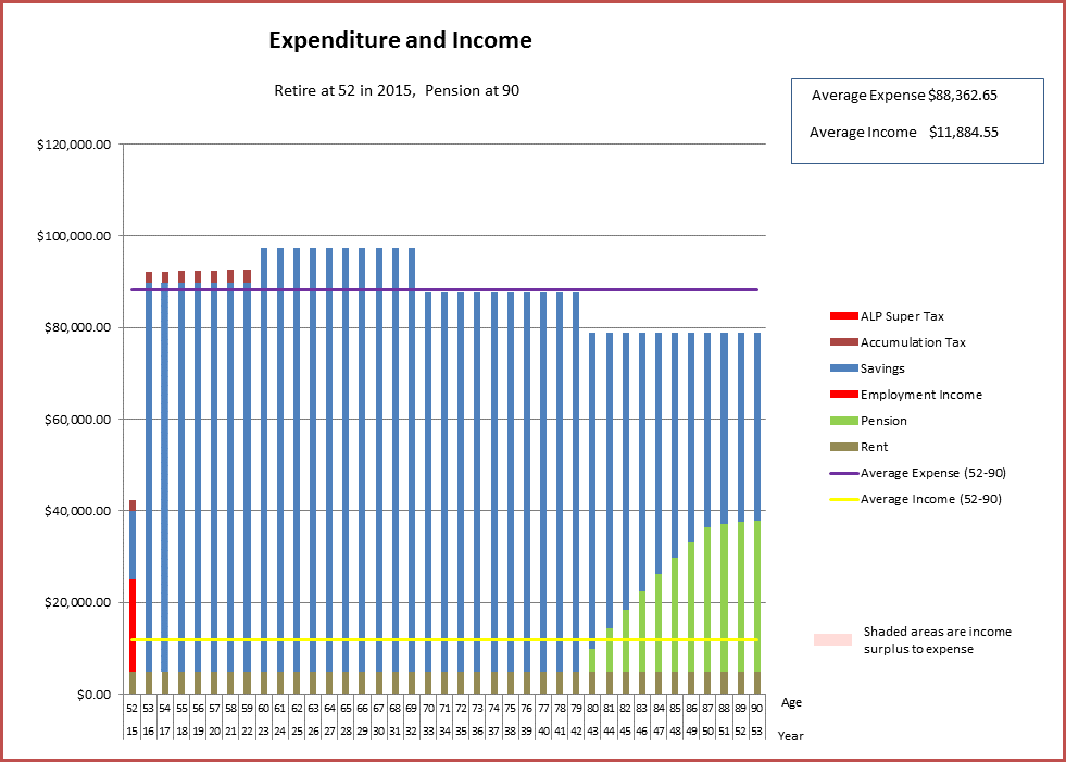
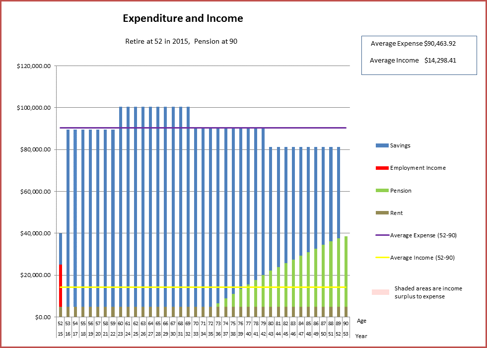
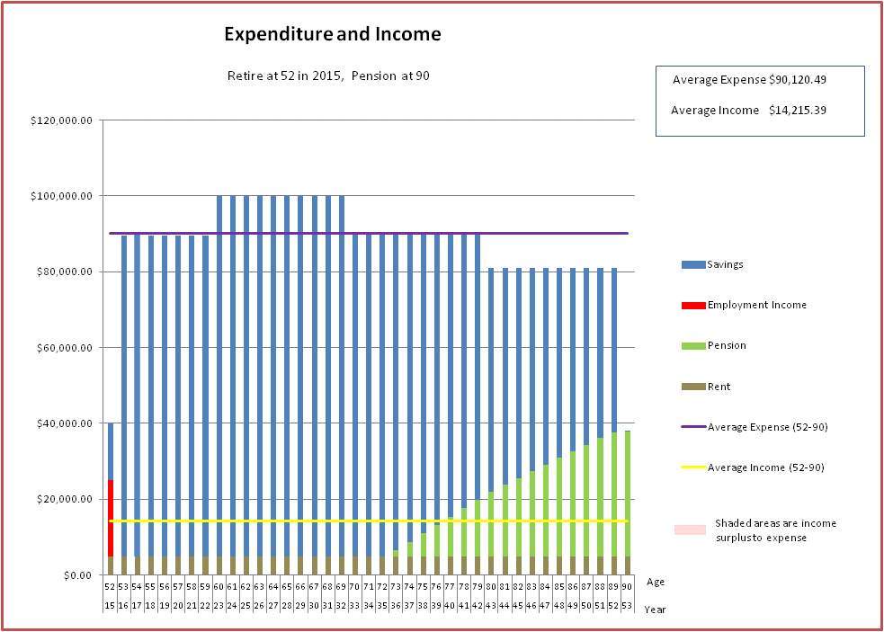
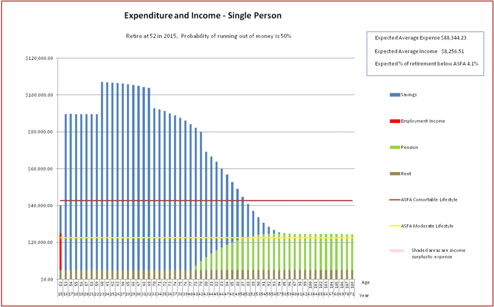
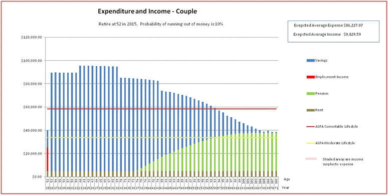
Let’s take a look at how the single person fares with the existing standard model in which we solve for running out of money at 90. Here is the latest couple spending pattern, as documented in the Mathematical Tweaks and Diversions Post:

image2

The spending pattern for the single person is similar, except we are now using the Single Pension:

image1

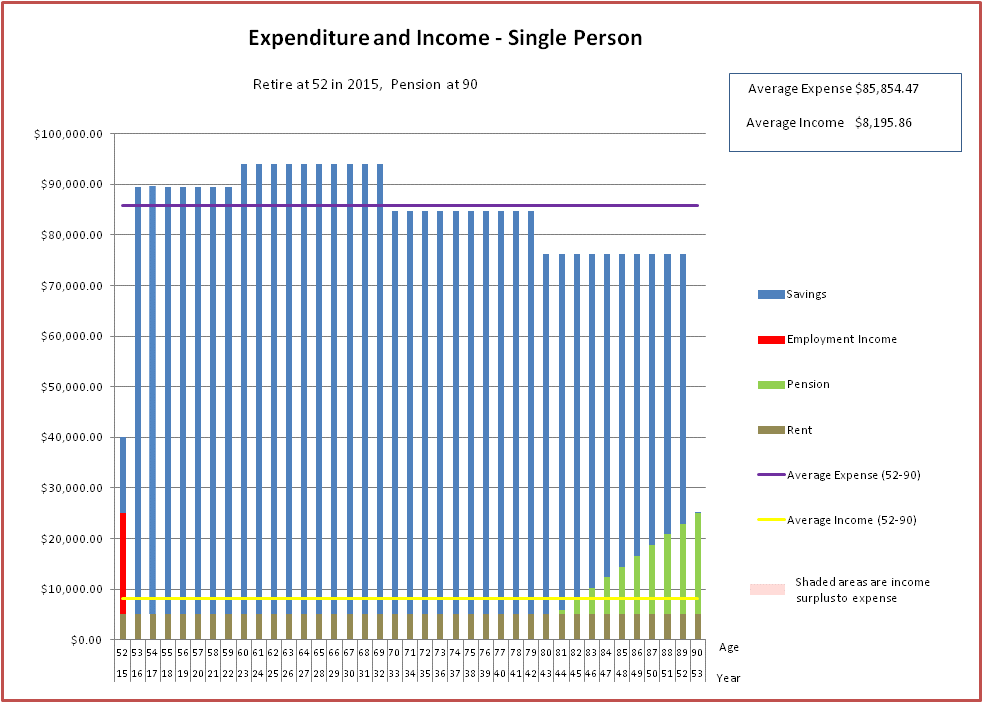
Notice that the Age Pension amount has gone down significantly, and consequently the average expense. One of the assumptions we question in this post is the validity of choosing 90 as the age at which we decide we don’t need any more money. Why was this chosen, and is it a sensible decision?

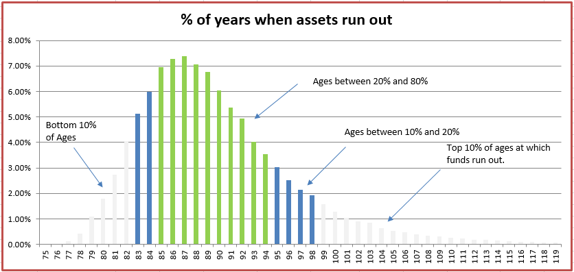
The graph below is the same graph as the graph in point 4 of the previous section, except now we have added the green line corresponding to the age of 90.

image003

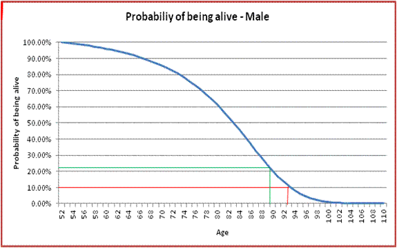
From this line we can see that there is approximately 23% chance that the retiree will be alive at 90. So, using the spending level in the above single person spending graph, there is a 23% chance that the retiree will run out of funds and be on the Age Pension only.

Rather than choosing an age at which we target to funds to run out, and then work out the probability that we will run out of funds, we can do it the other way around. That is we can chose a probability of running out of funds that we are comfortable with, and then work out the age we should target. So, for example, if I found a 10% chance of running out of funds to be more acceptable, I should target an age of just over 93 (the red line in the graph above, and also shown as the yellow line below). Settling on an age of 93, of course, would reduce the spending amount available each year as the funds would need to spread over more years.

image6

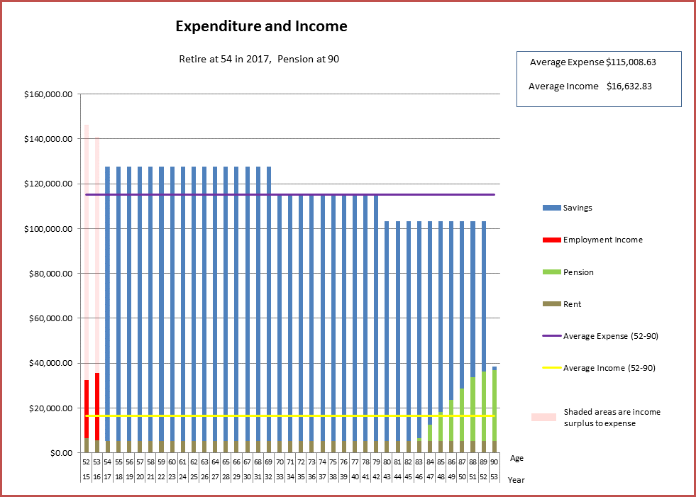
So, let’s assume I have settled on acceptable probability of running out of funds (rather than age of running out of funds), and for the sake of argument it is 10%. This tells me I should plan to live to just over 93, and I should moderate my spending to allow for this. During my second year of retirement (the first year always involves spending $40K), I spend the amount worked out by the model to spend between 53 and 54. This is shown in the diagram below (note there is some spending in year 93 as I should plan to live to approx 93.4 rather than 93):

image8

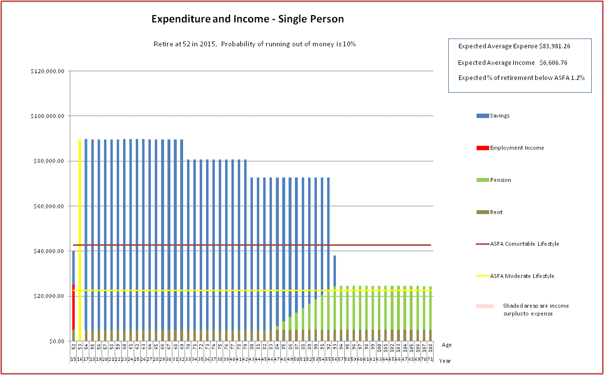
The column in yellow now becomes the spending amount for my second year of the spending plan I am generating (an adaptive spending plan).

Now let’s look at the third year of retirement. At the start of this year I still want to spend at a level that means there is only a 10% chance of running out of funds. However,  there is now a new age at which I should target to achieve this goal and it is slightly more than the original target age.This is shown as the yellow bar in the diagram below.

image7

I now need to work out my spending levels again to work out what I should spend between 54 and 55, and it will be slightly less as the age that my funds (less the amount spent between 53 and 54) need to last is slightly more. This process continues over each year or retirement, with the amount to spend declining each year (slowly at first, more quickly later).

After going through the above process, the plan using 10% as the figure for the chance of running out of funds generates the adaptive spending plan shown below:

image4

This type of plan is more sensible than the original fixed spending model, because it takes into account the fact that for each passing year that we live our expected lifespan increases. It is sensible to spread our remaining assets over a time period that takes into account our expected remaining lifespan, rather than spreading them over a period up to a fixed age (e.g. 90).

Note that I have implicitly assumed that an individual would like to maintain the same probability of running out of funds throughout their lifetime. That is, at the commencement of each year, an individual will work out the age at which they are likely to be alive with no more than, say, 10%, and divide up funds between now and then. I think this is a reasonable assumption. If an individual would like to spend a percentage amount less (e.g. 10% less at 70 and another 10% less at 80, as per above), this can be accommodated by the model as described in other sections.

Here is an animation showing how the spending pattern varies by the chosen probability of running out of funds:

Animated GIF

Note the “Expected Average Expense” in the top right of the above graphs. In the original fixed spending model, we worked out the spend averaged over all the years starting from the year of retirement and ending in the year we run out of funds. Now that we have mortality statistics, we can work out a more meaningful statistic, the expected average spend level, i.e. average spend levels weighted by probability of death at a given age. If Ei is the spend per year, this Expected Average expense is generated by the formula below:

{\displaystyle \sum_{n=52}^{106}(\frac{\sum_{i=52}^{n}E_{i}}{n-52+1})(q_{n}\prod_{i=52}^{n-1}(1-q_{i}))}

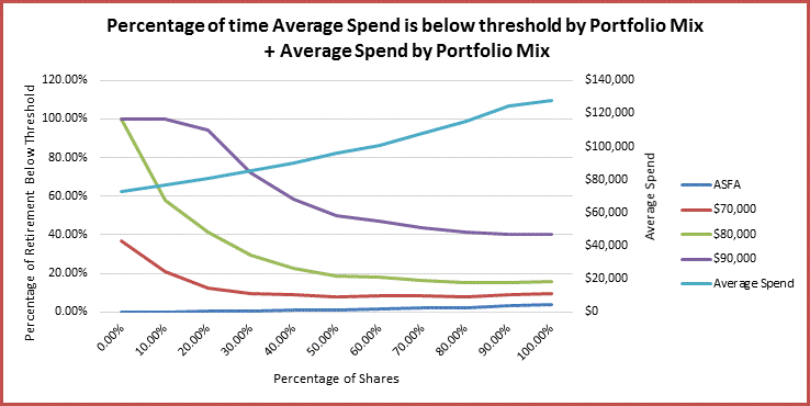
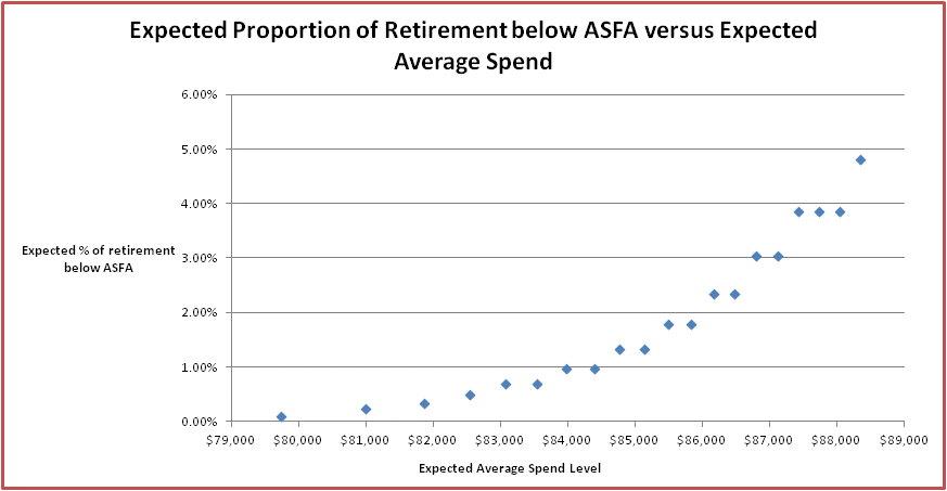
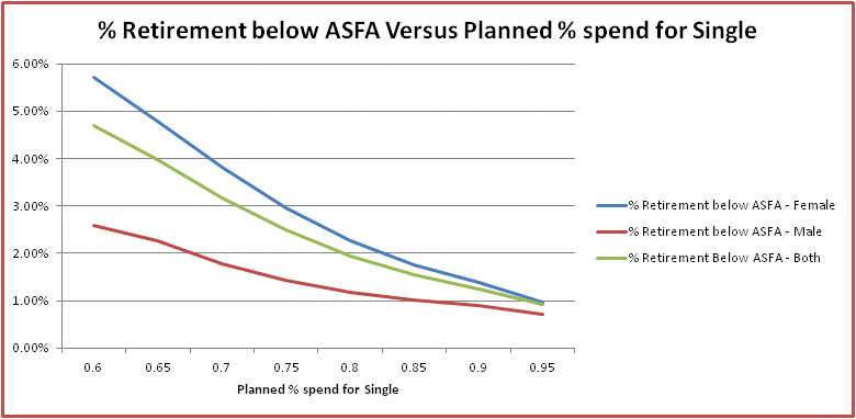
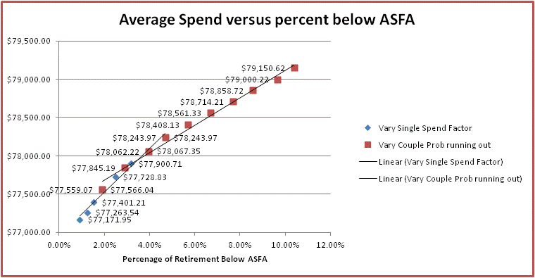
In the adaptive spending plans, spending declines as we age. It no longer makes sense to think of the age at which funds run out, as we did for the fixed spend model, it now is more sensible to look at when spend levels decline below an acceptable threshold.  ASFA publish figures on the annual funds that represent a comfortable spending level for singles and couples with and without home ownership. According to this press release,  for a single person who owns their home the comfortable threshold is in early 2015, about $42.6K. Using this figure as an acceptable threshold and a probability of not running out of funds of 10%, you can see in the above diagrams that spending will not be less than the threshold until about age 96. You can also see in the mortality graph earlier in the post, that the probability of being alive at 96 is quite low (a few percent). We can also work out the expected proportion of our retirement below the ASFA threshold (or any other threshold for that matter). The diagram below shows the expected percentage of retirement below the ASFA limit and below $50K and $60K per year against the percentage probability of running out of funds. It also shows the age of falling below the ASFA limit, and the probability of falling below the ASFA limit.

image7

Using this diagram, if I have a certain expected maximum expected proportion of time spent below ASFA in mind, I can choose a probability on the left hand axis and see how that maps to the probability on the horizontal axis using the green line. This probability can then be used to generate a spending pattern. So, if I would like to have an expected proportion of my retirement below ASFA of no more than 0.5%, I would choose a probability of not running out of funds of 90%, and this would generate the 10% adaptive spending plan shown at the start.

Of course, the expected proportion of time spent below ASFA will increase as we age (and eventually be 100% if we live long enough).

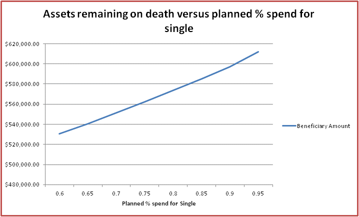
The diagram below makes the mapping between expected proportion of retirement below ASFA with expected average spending levels more explicit:

image1

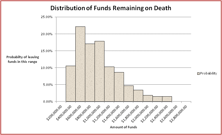
The other thing we can do now that we have mortality statistics is work out the expected value of assets left behind to beneficiaries. Because we know the amount of assets at each age for a particular spending pattern, and now know the probability of dying at that age, we can work out the amount we can expect to leave behind. The more conservative the spending pattern (the lower the probability of running out of money chosen), the more we can expect to leave behind.

For the spending pattern with a probability of running out of funds of 10%, the graph below shows the probability distribution for the amount of funds left behind:

image8

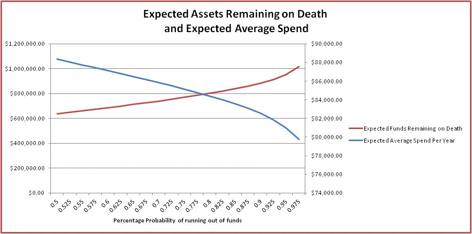
The graph below shows trade-offs between raising/lowering the probability of running out of funds chosen for your spending pattern, the expected spend level and the expected amount for beneficiaries. You can see that as the probabilities become more conservative, the expected average spending levels decline, and the expected funds remaining on death increase.

image6

Conclusions – Mortality and the Single Person

In conclusion, in this section we have:

  • Shown how we can develop a logical way of spending your funds which takes into account both your present funds, and the expected remaining duration of your life.
  • Shown how this spending pattern varies in accordance with how much you value spending in the here and now versus how much you would like to avoid the possibility of living with a reduced income in later years (specifically having a high proportion of time in retirement spent below the ASFA comfortable standard). This variance is controlled by a single parameter.
  • Shown that it is possible to generate a probability distribution and an expected value of funds remaining on death using the developed spending pattern and how the these vary with the above mentioned parameter.

Mortality and the Couple

OK, now that we have looked at using mortality statistics to gain financial insights into the spending levels during retirement for a single person, let’s now look at the married couple.

To begin with, we will look at some mortality graphs which will be of assistance when working out spending patterns and assets.

Couple Mortality Statistics

We can work out the following related to couple mortality:

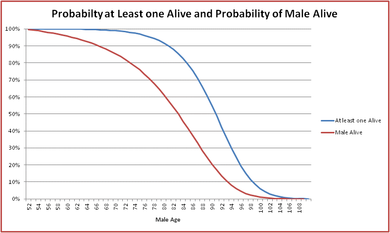
  1. Most people know that females, on average have a longer life expectancy than males. Not only that, but in most partnerships, the female is usually a few years younger than the male. Put these together and the female partner will usually end up outliving the male by quite a bit. The below graph shows the probability of being alive for subsequent years for a 52 year old Australian male and a 52 year old Australian female.

image1

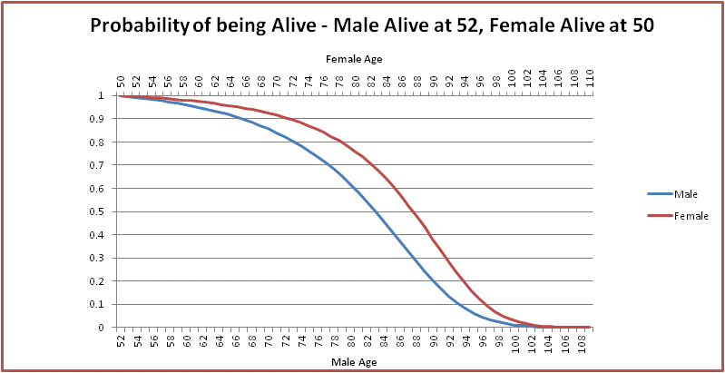
  1. The below graph shows the probability of each person in the partnership being alive assuming that the male is two years older, the male is 52, and the female is 50:

image2

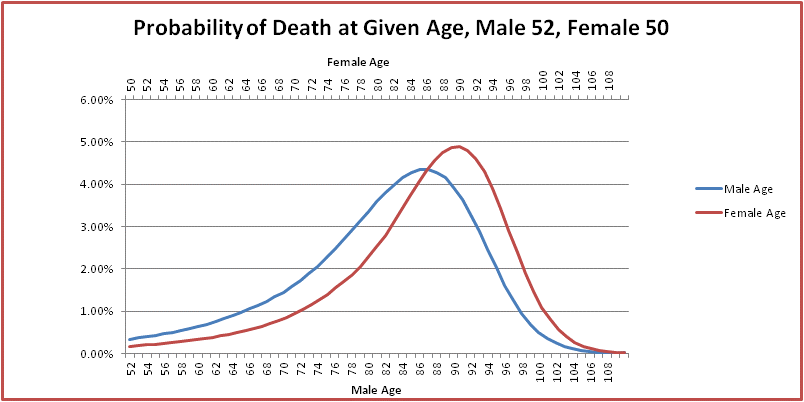
  1. The below graph shows the probability of death between n and n+1 for both the male and female, assuming the male is 52 and two years older than the female. You can see that the death rates for the female occur quite a bit later than the male.

image3

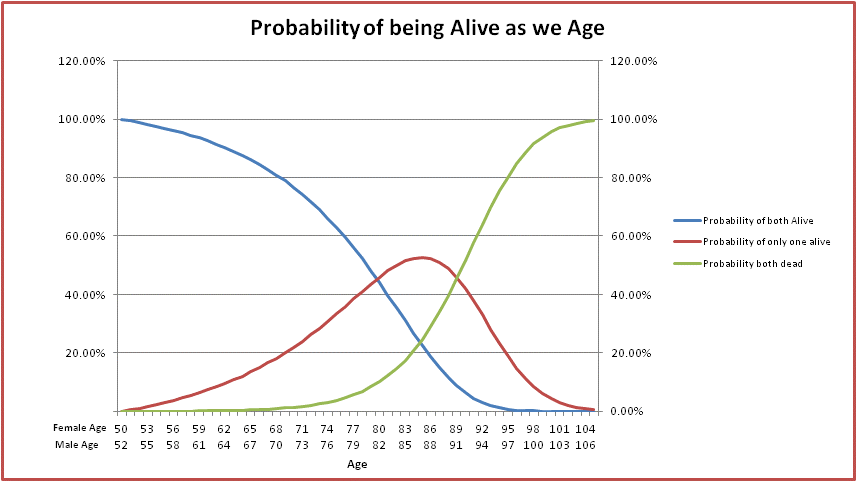
  1. The below graph provides some information on likelihood of both partners being alive, one only alive and both dead, assuming the male is 52 and the female is 50. Interestingly by the time the male is about 81 there is a 50% chance that one one of the couple has died. Note that the age pension  shifts down to the single pension when one of the couple dies, so the couple spending patterns that have used the assumption of the couple pension until 90 are not really realistic.

image2

  1. Here is a graph which compares the probability of at least one partner in the couple being alive against the probability of the male being alive. You can see there is quite a difference. Because spending occurs while  the couple or a single person survives, we can expect quite a bit of reduction in the expected beneficiary amount when comparing the couple with the single person.

image5

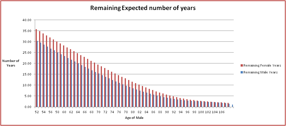
  1. Lastly here is a graph showing the expected number of years to live for a couple proceeding through retirement with the male age 52 and female age 50. You can see that the female has quite a few more years than the male.

image4

Couple Spending Patterns and Remaining Assets

Now let’s look at how we can use mortality statistics to work out appropriate spending levels for the couple, and also determine the expected assets remaining. We will use the same kind of ideas as used for the single person. However, for the couple, it is a bit more complex as we need to take into account all the possible combinations of the age of death of each person in the couple.

Firstly, each member of the couple will need to choose a probability of running out of funds which is acceptable to themselves. This will be used when the other member of the couple dies, i.e. when they become single. This is a personal choice and reflects how much the individual values spending in the here and now versus reducing spending now in favour of conserving savings that could possibly be used in the future. Information on how this can be chosen is discussed in the first part of this post.

Secondly we need to work out the spending levels while a couple. To work out these values, two factors need be agreed on by the couple, by mutual consensus. These are:

  1. The planned spending level, in terms of a percentage of the spending level for the couple, for the surviving partner. Costs for a single person will be less than for a couple, but more than 50%. 60% might be a reasonable figure and and I have used this figure as the default figure in this post.
  2. An agreed acceptable percentage probability of running out of funds, assuming a constant spend while a couple, and a constant spend for the surviving partner in accordance with the percentage above. Note that “running out of funds” means that, using the planned spending levels above, at least one member of the couple is alive at the time that all funds run out. I will use 20% for my default here.

These two numbers are used to determine the spending levels of the couple while they are a couple. Some strategies used to select these numbers are to choose numbers that sound reasonable, to use the default values as mentioned above, or to look at graphs showing how various parameters (such as expected proportion of retirement below ASFA levels) vary as we change them. This latter option is explored later in the post.

Now we will look into how we can generate couple spending levels. Note that by using the couple spending rules above, we can work out, for a particular level of spending, which age combinations of death  will have funds remaining, and which will result in running out of funds. In general, the longer we live or the higher our spending level, the more likely we are to run out of funds. As we know the probabilities of each of the age combinations of death, we can work out the probability of running out of funds for a particular spending level. We want the maximum spending level possible, while still ensuring that the probability of running out of funds for either member of the couple is less than the couple nominated amount. This determines the spending level to be used as the beginning of a year.

image2

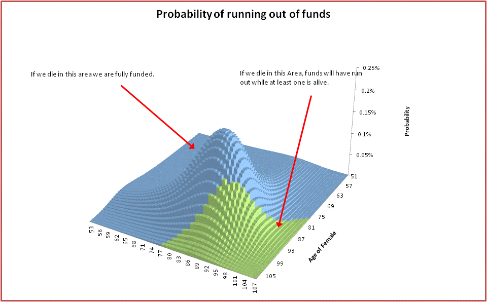
The diagram above provides some more information on this approach. It shows the probabilities of all the possible combinations of ages of death for the couple (starting from the male age of 52), and is colour coded to show in which of these we run out of funds given a proposed spending level. The area colour coded in green is the area in which we do run out. The sum of probabilities in this area is less than 20%. The spending level is chosen as the maximum level possible while still keeping the green area less than 20%.

In keeping with the techniques used for the single person, we want the amount to be spent to be adaptive. That is, it varies each year into retirement based on the additional information that we are both alive. The spending level for a couple in our situation, with the choice of 20% for the probability of not running out of funds for either of us, and a value of 60% to be used for as the percentage of spend for the surviving partner is shown below.

image1

Note the similarity with the adaptive spending plan for the single person. Each point on this graph has the property that, moving forwards, if we spend at the nominated level while a couple, and at 60% of this value when one member of the couple dies, then we can expect that there is no more than a 20% chance that either person in the couple will run out of money (i.e. both will die before the funds are depleted). In addition, the spend level is the maximum level that has this property.

Now that we have the spending levels while we are a couple, the next thing to do is to work out the spending levels when one of us becomes single. Now we just use the same approach as the first section in this post, i.e. the approach used for the single person, using the percentage of not running out of funds nominated by that person.

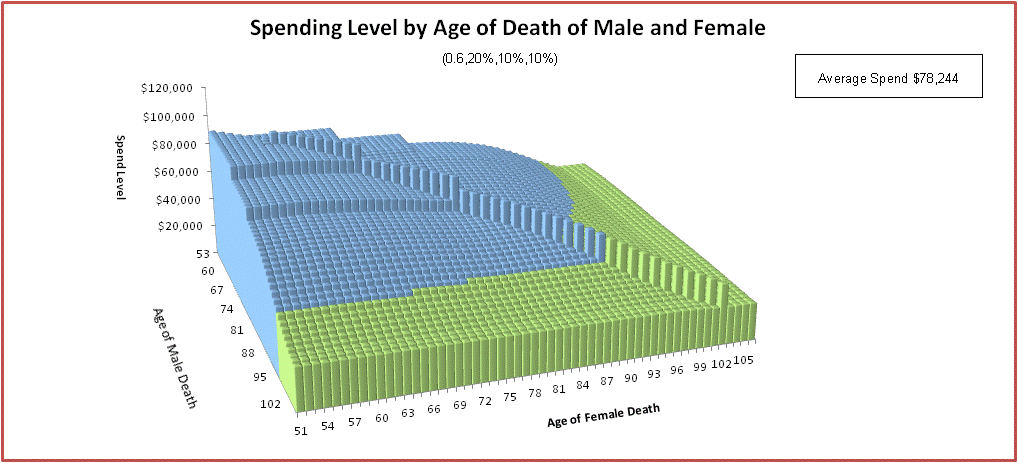
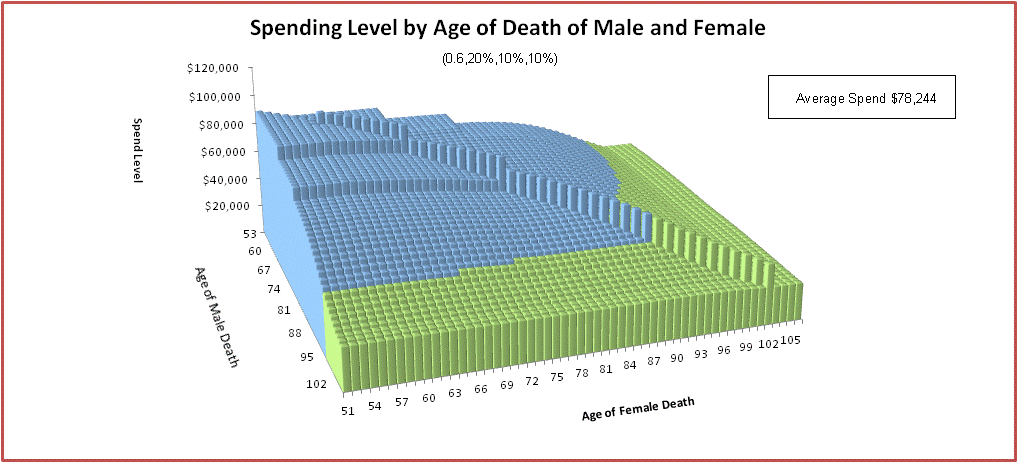
Here is the graph which shows the spending level at each age combination, including the couple spend levels already worked out:

image2

The graph below should help with understanding this diagram:

image3

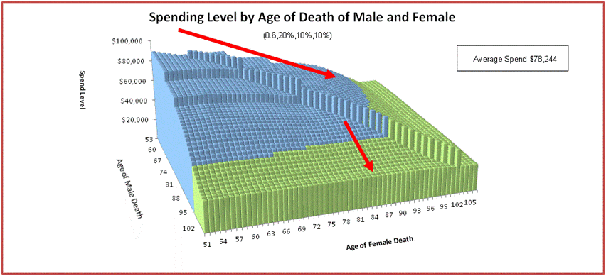
When you are a couple you proceed down the first red line in the above diagram. That is you spend at the rates down the diagonal spike in the middle of the graph. When one partner in the couple dies (shown in the above as the female partner dying at approx 86), the remaining person in the couple spends in accordance with the second red line.

Note that:

  • The total average expected spend can be worked out in a similar way to that used with the single person i.e. by working out the average spend for each combination of death, multiplying by the probability of this combination and summing. In this case, it is approx $79K, which is quite low.
  • The diagram is colour coded showing  which age combinations are above (blue) or below (green) the ASFA comfortable spending levels (taking into account if we are a single or a couple at the time).
  • By summing up all the probabilities that are blue, you can work out the likelihood of not falling below the ASFA comfortable spending level. In this case it is 59%, which is not that high! You can also work out the proportion of retirement expected to be below ASFA for both members of the couple, the male and the female (again using a similar technique used to calculate the average spend). In this case it is 4.27%, 3.1%.  and 4.77% respectively. As you might have expected, the female, due to her longevity, is expected to have the highest proportion below ASFA.
  • You can see that on most occasions the spend rate for the couple is higher than the single. The reason for this is:
    • We are planning for the single person to have a spend of 60% of the couple.
    • The differences in the conservativeness of the single spending plan and the couple spending plan. If for example, the single spending plan is quite conservative, we would expect a lower spend than the spend that is used by the couple at the same age.
  • Note that if the female dies early then the male spend level is just as high as the couple. The reason for this is that the male has more funds than necessary to get through the average lifespan, because the spend level for the couple takes into account the longer lifespan of the female. This counters the lower single age pension.
  • While the diagram looks symmetric, it is not because the female and male partners have different mortality statistics, and therefore different spending patterns. Also if there was a large gap in age between members of the couple, the diagram would be much more asymmetric.

Here is the spend diagram from another perspective, this time showing the lower spend of the female:

output_KciQ6f

We can also work out average spending levels in a few different ways

Average spending while we are a couple: $86,949

Average spending for Female when Single: $49,677

Average spending for Male when Single: $56,486

Overall average spending for Female: $76,062

Overall average spending for Male: $81,162

Overall average spending: $78,244

Here is a diagram showing the assets for each combination of age of death:

image7.gif

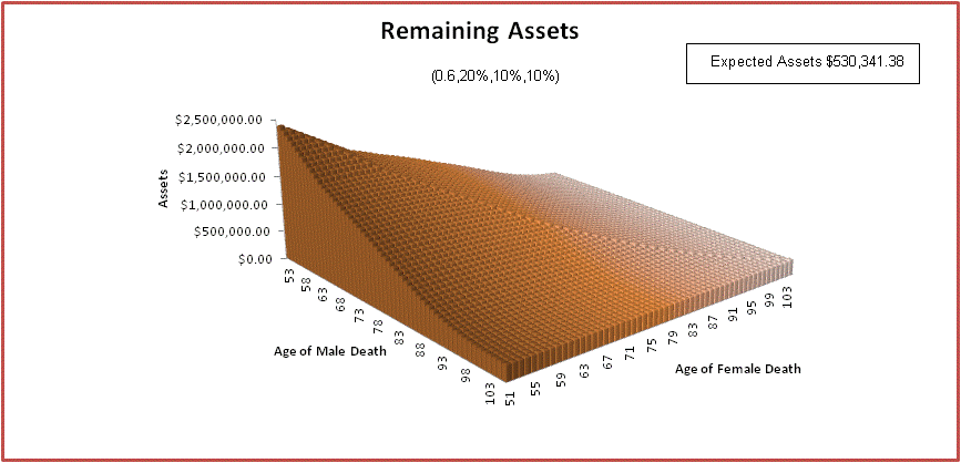
We can weight this by the probability of each combination of age of death to determine the expected value of assets remaining on death.  In this case it is approx $530K.

Working out the best parameters for the couple

In this section we see how the spending patterns are affected by changing the chosen probability of running out of funds as a couple, and the chosen percentage of couple spend chosen for the single. This is done by showing how the spending patterns visibly change as we modify the parameters.

Varying the Single Spending Percentage

The factor we use for the single spending when working out the couple spending model is a bit mysterious. When this factor is low (e.g. 60%) it tends to:

  • Increase our spending while a couple and decrease it while we are a single.
  • Increase the expected proportion of retirement spend under ASFA
  • Increase in the overall spend
  • Reduce the expected value of assets left to beneficiaries.

If you especially value your time while a couple (which I do!), I recommend a low value for this figure.

The graph below shows how the overall spending changes with this parameter is shown below.

output_D3jAu7.gif

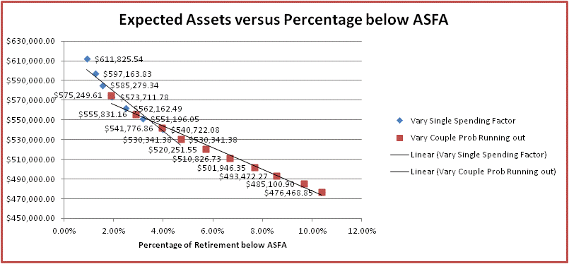
This graph shows how the assets change with this parameter (not a great deal!):

output_556VnR

These graphs provide more aggregate information for the changes. This one shows how the % of time spend below ASFA varies with the figure.

image1

This one shows the how the spend levels vary:

image2

This one shows how the expected assets remaining for beneficiaries vary:

image3

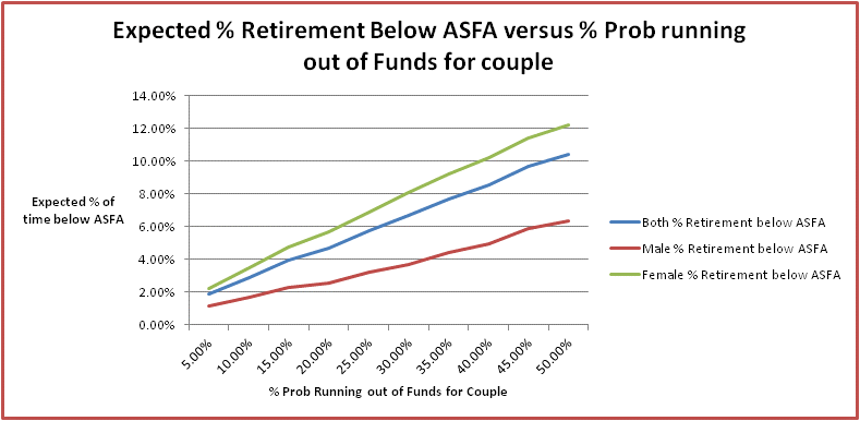
Varying the probability of running out of funds for the couple

OK, now we can look at varying the percentage probability of running out of funds for the couple. We expect that by increasing this we would see an

  • Increase in the couple spend,
  • Increase in the overall spend,
  • Reduction in the amount of funds left to beneficiaries
  • Increase in the expected amount of time spent under ASFA

In other words, much like a reduction in the Single spending percentage. This figure should be increased if you prefer to spend in the here and now, and are less concerned with preserving funds for the later years of retirement.

Let’s see if our predictions bear out. I have kept the percentage spend of the couple spend for the single person fixed at 60%, and the single probability of running out of funds fixed at 10%,

Here is the graph showing how the % of time spend below ASFA varies with the couple prob of running out of funds. As expected, this proportion increase as the couple probability increases.

image1

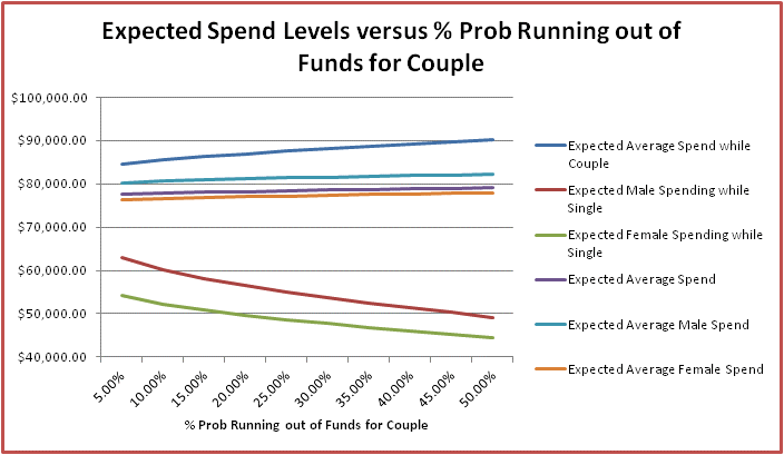
And here is the graph showing how spending levels vary. As expected, spend levels for the couple and overall spending increase, although the latter not significantly so. Single spending levels decline quite a bit.

image2

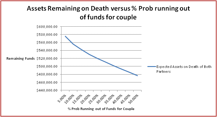
And here is the graph showing how expected assets remaining for beneficiaries vary. As expected they decline as the % prob of running out of funds for the couple increases.

image3

Combined Scatter Diagrams

Finally here are the combined scatter diagrams:

image1.gif

image2.gif

Why have our spending levels and Assets to beneficiaries dropped

You can see from the original overall spending graph and the previous section, average spending levels have dropped by about $10K (or about 11%) when compared with the original couple spending model, and also the amount of funds left by the couple to beneficiaries has dropped about $350K (or about 42%) when compared to the amount left by the single person. Why is this?

The average spend has reduced because:

  • In the new model, the couple must set aside funding for future years every year while in the original model we only set aside funds until 90.
  • In the new model, it is expected that in many years the Single Pension will be used rather than the higher couple pension. In the original model, the couple pension was used at all times.

The average spend is increased because:

  • We are now averaging the expected spend as weighted by age of death. The lower spend in later years will be given less weighting.

The expected funds left to beneficiaries is reduced because:

  • We now have a couple spending money and reducing the remaining funds available on death. When one partner dies, the other partner continues to spend. The average lifespan of the combined partner entity is significantly longer than the male individual.

Conclusions

Working out spending levels while incorporating mortality statistics has been a lot of work! Probably more than the rest of the blog combined. Is going to this level of complexity and detail worth it?

I think it is, for these reasons:

  • Previously we just chose an age at which we wanted our funds to last. This choice didn’t relate to anything meaningful, such as the expected percentage of retirement spent below the ASFA retirement standard. With mortality statistics we can select a spending pattern which relates to something real.
  • Previously we spent the same amount right up to the age at which we chose to run out of funds. This is not realistic behaviour because any rational person would reduce their spend when they realize that there is a good chance of exceeding this age. You can use mortality statistics to work out how you should reduce your spend to anticipate this possibility.
  • Previously we had no idea how our spending plan would impact on the amount of funds we are likely to leave beneficiaries. With mortality statistics, we see how the expected value of funds left to beneficiaries relates to the the spending pattern adopted.
  • When we use mortality statistics the estimated average spend is different than the spend worked out previously. In fact under most circumstances it will be lower. This additional information may help to determine a good time for retiring.