Planned Versus Actuals
The last series of graphs I will do are some examples of graphs that can be used to support comparison of your retirement plan with what is actually happening. The idea is that once you have completed your retirement plan, as you progress into your retirement “Planned versus Actuals” graphs can be handy in order to show:
- How you are tracking against your plan in terms of how much you have been spending
- How your investments are tracking against your plan
- How your income (if any) is tracking against your plan
- Given your spending, investment performance, and income, how does this affect how much you can spend in subsequent years? This is what most people will be interested in and where I will focus the graphs.
At the end of each year, the following information is required (most of which can be found reasonably easily) in order to update your actuals information:
- Actual income, including any rent and age pension
- Actual Super
- Actual Cash
- Actual Super return
- Actual Cash interest
- Actual (or estimated) value of property assets.
- Actual inflation rate
- Any changes in your planned Spending Profle
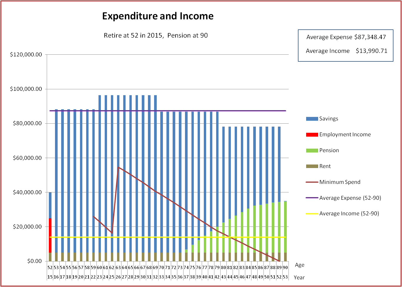
Here is my original plan that I will use as my baseline. This involves retiring in early 2015:
Now, I assume that it is 2016 and I have actually worked in 2015 (rather than taking the year off as originally planned). So I enter the details of actual income, Super performance etc. I have made up some reasonable numbers for the actuals in order to simulate my position at the start of 2016. I also assume that I don’t take a low cost year off after working (which was part of my original plan, as you can see above).
Then I get the diagram below:

The dark blue is showing the new recommended expense against my original plan (light blue). So, after working an additional year the excel is saying I can afford an additional spend of about $10K/year during the first 7 years and a little bit more during the remaining years. Note that these figures are in 2016 dollars (which are the dollars I will most care about then). Also note the horizontal axis – a “P” suffix after the year indicates the original planned value (adjusted for inflation), an “A” suffix indicates an actual value, while an “NP” indicates a new planned value – based on the actuals to date.
Here is a diagram assuming it is 2018 and assuming I worked 2 more years and spent a low cost year off and have now decided to use the Bernicke Spending model (see Firecalc post). Again, this is in 2018 dollars. I quite like this new plan as it is consistent with travelling during my early retirement years. It is a plan that I will maintain as an aspiration.

Putting it all online
Well, I would like to put this all online, but I am working and wouldn’t be able to spare the time! There is something called Excel interactive web pages:
http://office.microsoft.com/en-us/excel/embed-an-excel-spreadsheet-on-a-web-page-FX102598267.aspx
which would make this relatively easy. The idea is you put your XLS on the Microsoft Skydrive and public users can enter information and the Skydrive-hosted Excel will generate online graphs. Unfortunately Excel interactive web pages don’t work with:
- Macros
- Excel Solver
both of which are required in order to generate the graphs.
So, I think I would need to use Java or a similar language and hunt around for relevant libraries to perform non-linear optimizations and also generate graphs. I would also have to generalize it to take into account generic assets, add in error conditions, maintain a database of plans, and also make sure it can handle concurrent connections/users. Also might need a host to run it on, which might cost a bit (maybe Amazon Web Services). Probably a lot of work! Maybe I will look into this on my low cost year off!
