In the previous post we learned that, through the use of the Schiller Ratio (otherwise known as the CAPE), it was possible to gain a good indication of the likely performance of stock markets over the subsequent 20 years.
In the Sequencing Risk post, we learned that, even if we experience a series of returns with a high average return, the sequence of the returns can have a huge impact on our spend levels in retirement. We also learned that one effective way of mitigating sequencing risk was to build up a savings buffer.
If we could predict poor returns in the near term (in addition to the mid/long term) prior to a proposed retirement date, this would be very useful, as it would be a good indication that we may be impacted by sequencing risk. It would allow us to make a more informed decision on the appropriateness of working a bit longer to build up a savings buffer.
This post looks at the Yield Curve as a tool that may help with predicting poor returns in the short term.
The Yield Curve
A yield curve is a graph showing several interest rates (or yields) across different contract lengths. Normally the longer the contract length, the higher the yield, although increases in yield normally diminish as the contract length increases. The theory is that a purchaser of a longer term security will want to be compensated at a higher rate due to the higher uncertainty over the longer period.
This diagram shows how the yield of US treasuries has varied over time (to about 2016). You can see that the yield curve for a particular year normally slopes upwards as the contract length is extended, although this is not always the case.
The slope of the US government security yield curve turns out to be a good predictor for growth in the US economy in the short term. An inverted yield curve (i.e. a curve with negative slope) has also been an accurate predictor of pending US recessions.
The diagram below shows the 10 US year treasury rate less the 2 US year treasury rate since the mid seventies, with the areas shaded in grey being US recessions. You can see that once the 2 year rate exceeds the 10 year rate, a recession always follows shortly afterwards (typically 12 months).

And here is another showing the relationship between US GDP growth and the US Yield curve (10y vs 2 y):

When the 10 year – 2 year differential becomes negative, US growth becomes negative shortly afterwards.
At the time of writing (4th December 2018) 2 year rates are 2.80% and 10 year rates are 2.91%. The yield curve is not yet inverted, but it’s getting pretty close.
The Australian Yield Curve
Of course, Australia has its own government yield curve. However, it turns out that Australian Growth is not tightly coupled to the Australian Yield curve shape.
US Growth Versus Australian Growth
The graph below plots US Growth versus Australian Growth.
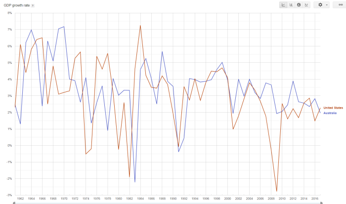
You can see that, in most cases, US growth and Australian growth have been closely related. Both the US and Australia experienced low or negative growth in 1982, 1991 and 2001. The US had a large drop in growth during the GFC in 2009, but a similar drop was not experienced in Australia. During the most recent period, growth of the Australian economy has become heavily dependant on exporting minerals to China, and this may be a reason for the decoupling.
An inverted US yield curve predicts a US recession fairly well, and, with the exception of the most recent US recession, a US recession has also been indicative of an Australian recession or slowdown.
US Growth and Australian Superannuation
OK, what we are really interested in is the relationship between US Growth and Australian Superannuation funds! The relationship using AustralianSuper balanced fund as a representative fund is shown in the diagram below.
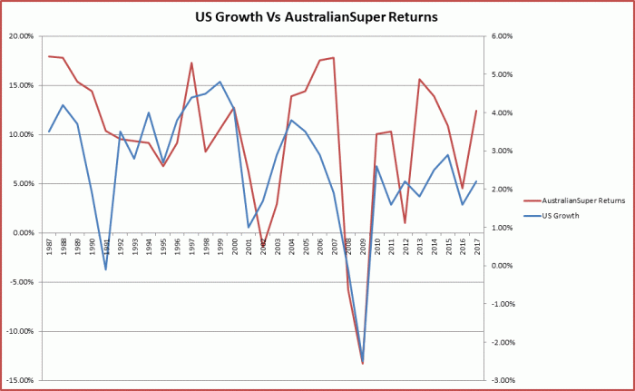
As you can see, growth in the US economy and the performance of the AustralianSuper balanced fund is closely related. This is unsurprising as a significant percentage of the AustralianSuper balanced fund is made up of Australian and US stocks, and these are both correlated with US growth. As an inverted US Treasuries Yield curve is a strong predictor of a US recessions, we can see that an inverted US Treasuries Yield is also a predictor of negative AustralianSuper balanced option returns (and likely most other funds with significant Australian and/or US stock exposure).
Conclusion
The US treasuries Yield Curve is a tool that can be used to predict US recessions. An inverted Yield Curve has predicted 7 of the last 7 recessions in the US.
US recessions are defined by reductions in US Growth and US growth is correlated with the AustralianSuper balanced fund returns (my Super fund!).
As such, an inverted US Treasuries Yield curve is a likely predictor of negative returns from the AustralianSuper balanced option fund and most likely with other Australian Super funds with significant exposure to Australian and/or US funds.
If you are considering retiring soon, and would like to mitigate Sequencing Risk, the information from the Yield curve may be an important factor in your retirement planning.
